Nobody Reads Websites the Way You Think They Do

You've got the vision. You know what you do, who you serve, and why it matters. You might even have a gorgeous website design sitting there. The colors are right, the layout feels like you, and you're so close to finally having a presence online that actually reflects your work.
But then comes the part that stops almost everyone: the writing.
Suddenly the blank page feels enormous. You know you need a Home page and an About page and a Services page, but when you actually sit down to write them, the questions start piling up fast. What do you lead with? How personal is too personal? Should your Services page explain every detail of your offer, or just give people enough to reach out? Does your About page need to sound professional, or can it sound like you? And where exactly do you put all the things you want people to know without overwhelming them the moment they land on your site?
If any of that sounds familiar, you are so not alone. Website copy is one of the most common places creative business owners get completely stuck, not because they don't know their work, but because no one ever taught them the purpose behind each page. And when you don't know what a page is for, it's almost impossible to know what to write.
That's what this post is here to change. We're going to walk through every core page your website needs copy for, what each one is designed to do, and exactly what you need to write, so you can stop second-guessing every word and start showing up online with the clarity and confidence your work deserves. Whether you're building from scratch or finally refreshing a site that hasn't felt quite right in a while, this is your starting point.
But First, A Mindset Shift
Before we get into the pages themselves, there's one reframe that makes all of this easier, and it's worth saying upfront. Your website isn't a brochure. It's not a resume. It's not a portfolio you hand to someone and hope for the best. Your website is a conversation, and like any good conversation, it has a flow. There's an opening, a building of trust, a moment where someone decides they want to go deeper, and eventually a point where they feel ready to take action. Every page on your site plays a specific role in that journey. When you understand what each page is actually for the writing stops feeling like guesswork and starts feeling like intention. You stop trying to say everything everywhere and start writing with a clear sense of purpose.
That shift alone changes the entire experience of building a website, both for you and for the people who land on it.
The Home Page
Your Energetic WAiting Room
Think of your home page like a waiting room. Someone has already found you. They clicked the link, they typed in the URL, they followed a thread of curiosity that led them here. They're not a cold stranger anymore. They're sitting in your space, looking around, getting a feel for the vibe. And in that moment, usually within the first few seconds of scrolling, they're making a quiet, almost unconscious decision: do I stay, or do I go? There's no dramatic exit. No feedback. No explanation. They just close the tab and move on, and you never know they were there. That's the reality of a home page that doesn't land. It doesn't repel people loudly, it just fails to hold them. Which is why what you put in that waiting room matters so much more than most people realize.
So what makes someone stay? Not more information. Not a longer page. Not covering every offer, every credential, every service you've ever provided. What makes someone stay is the feeling that they've arrived somewhere that gets them. People love when they feel that that the person behind this website understands who they are, what they're looking for, and what it's like to be in their position right now. That feeling of recognition is what turns a casual visitor into someone who keeps scrolling, clicks to your Services page, and eventually reaches out. Your home page has one primary job: make the right person feel immediately at home and show them clearly where to go next. It's not the whole story, it's the opening scene. The vibe check. The moment someone looks around the waiting room and thinks yes, okay, I'm in the right place. Everything else lives on other pages. Your home page just needs to earn the click to get there.
In terms of what the copy actually needs to do: your headline should speak directly to who you serve and what shifts for them when they work with you. Your intro should create immediate connection and set the emotional tone of your brand. A snapshot of your offers gives people a sense of the landscape and a clear path toward whichever direction feels right for them. And at least one strong call to action makes the next step obvious, so they're never left wondering where to go.
The About Page
Where Trust Gets Built
Here's something that might actually be a relief: your About page is probably the least visited page on your entire site. Most people who land on your website don't go looking for your bio. They go straight to your services, your work, your prices. These are the things that answer the question can this person help me? They don't especially care about your story, your credentials, or your journey. That might sting a little to hear, but it's actually liberating, because it means you can stop trying to write your About page for everyone and start writing it for the specific person who does end up there.
So who is that person? Someone who is already interested in you. Someone who has looked around your site, resonated with your work, and thought I think I want to hire this person, and then clicked over to your About page to confirm that feeling. They're not coming to be convinced. They're coming to connect. They want to know if they like you, if they trust you, if your values and approach feel aligned with theirs. They want to feel like the person behind the work is someone they'd actually want to be in relationship with. That's the job of your About page: not to introduce yourself to a stranger, but to deepen the relationship with someone who is already leaning in.
Which means the biggest shift you can make in how you write it is to keep the lens on them even while you're talking about yourself. Your origin story matters not because it's interesting in the abstract, but because it explains why you're the right person to guide them through what they're facing. Your values matter not as a list of things you believe, but as a signal that you'll show up for them in the specific way they need. Your personal touch, the things that make you feel like a real, specific human beyond your job title, matters because it's often the thing that tips someone from I think I'll reach out to I'm definitely reaching out.
By the time someone reads your About page, they've basically already decided. Your job is simply to confirm that they made the right call.
The Services Page
Where Clarity Converts
Your services page is doing more work than almost any other page on your site. This is where someone who has already decided they like you and trust you comes to figure out whether what you offer is actually right for them, and that decision is being made based entirely on your words. Which means if your services page is confusing, vague, overwhelming, or just a list of offer names with no context, you are losing people who were already halfway to yes.
Here's a reframe that changes how you write this page: it doesn't have to explain every single detail or sell every offer you've ever created. Its real job is simply to help your people see the path forward. Show them what you offer, who it's for, and how someone can go deeper if it resonates. That's it. The goal isn't to close the sale on the services page; rather, it's to give people enough clarity and confidence to take the next step, whether that's clicking to learn more, filling out a contact form, or reaching out directly.
In practice, that means starting with a clear hero section that sets the tone and names what this page is about. Then a brief overview of your philosophy or approach showcasing how you work and why it matters. Then each offer gets its moment: a name, a short description focused on transformation rather than logistics, and a CTA that makes the next step obvious. You want someone reading your services page to feel like they're being gently guided, not bombarded with options or talked at with industry language they don't fully understand.
One of the most common questions I hear around the services page is whether you should have one page that lists all your offers, or a separate dedicated page for each service. And the honest answer is that it really depends on the depth and breadth of what you're offering. If your services are relatively straightforward and someone can understand what they are and whether they're interested in a few sentences, one well-organized page can hold all of them beautifully. But if you have offers that are complex, high-investment, or require a lot of context for someone to fully understand the value, like. a multi-month branding package, a group program, or a signature service with a detailed process, that offer probably deserves its own dedicated page where it can breathe. Think of your main services page as the overview: the place where someone gets the lay of the land and chooses their path. The individual service pages are where they go deeper on the specific thing they're already interested in. You don't have to choose one or the other, it is possible to have both (my services are a great example of that if you want to see this in action.)
That said, in my work with clients I almost always recommend starting with one page for everything and growing into multiple pages over time. It's so much easier to build something simple and strong first, and expand from there, than to try to build the whole system before you even know what's working.
The Portfolio Page
Let Your Work Speak
This is worth saying upfront, because a lot of people stress about this page unnecessarily: not every business needs a portfolio. If you're a coach, a healer, a strategist, a therapist, or any kind of behind-the-scenes service provider whose work happens in conversation and transformation rather than visible output, your work might not be something you can or should photograph and display, and that's completely okay. You can skip this page entirely if it doesn't serve you, and your website will be no less complete for it.
But if you're a creative whose work is visible—a designer, photographer, brand strategist, web developer, artist, anyone who produces something people can see and respond to—then your portfolio page is one of the most powerful trust-builders on your entire site. It's where your work proves what your words promise. And here's the thing that most people miss when they build this page: the context matters just as much as the visuals. A beautiful image without a story is just pretty. It might get a reaction, but it doesn't create connection. What shifts someone from wow, nice work to I want to hire this person is the story around the work: what the challenge was, what you created, how the client felt on the other side of it.
A brief framing for each piece or project, even just a few lines, turns a gallery into a narrative. It gives your visitor something to hold onto, something to see themselves in. Because when someone is considering hiring you, they're not just admiring your work from a distance. They're imagining themselves in that story, wondering if you could do something like that for them. Give them that bridge. Let the context do as much work as the visuals.
The Blog Page
Your Visibility Engine
If you have a blog on your site, you have one of the most underutilized tools in your entire marketing ecosystem, and most people treat it like an afterthought. They post inconsistently, write about whatever feels interesting in the moment, and never really think about what the blog is there to do strategically. But when your blog has a clear purpose and a consistent approach, it becomes something genuinely powerful: an engine that quietly, consistently brings the right people to your website long after you've stopped actively promoting it.
The primary purpose of a blog from a strategic standpoint is SEO, aka search engine optimization. SEO is basically just a fancy way of saying "how your website shows up when someone types a question into Google." Every blog post is an opportunity to create a piece of content that gets discovered organically, establishes your authority on a topic, and gently guides someone toward your work. The key is writing posts that are genuinely useful, keyword-aligned with what your dream clients are actually searching for, and connected to your offers in a natural way. Not every post needs to be a hard sell; in fact, the best ones rarely are. They just answer a question your person is already asking, and then show them where to go next.
Your actual blog page, the feed where all your posts live, also needs a few lines of copy. A short, clear intro that tells people what they'll find here and why it's worth reading makes a real difference. It sets the tone, signals who the content is for, and makes the page feel intentional rather than like an afterthought. And every single post should close with a call to action: to a relevant offer, a resource, your email list, or another post that keeps them in your world. Content without a destination is just content. Content with a clear next step is a funnel.
The Contact Page
Make it Intentional
Your contact page is one of the most overlooked pages on most websites, and it's also one of the highest-stakes. Think about it: the person who lands on your contact page isn't casually browsing anymore. They've already looked around. They've read about you, explored your offers, gotten a feel for who you are. They've decided they're interested. They are, in this moment, as close to a yes as a website visitor gets. If your contact page is cold, confusing, or asks too much of them, you can lose them right at the finish line.
What this page needs to do is make taking that final step feel easy, warm, and worth it. Your contact page is the bridge between interest and action, and like any good bridge, it should be smooth to cross. A warm, welcoming intro that acknowledges they're taking a step goes a long way. Something that says I'm glad you're here, here's what happens next rather than just a form floating in a void. A few words about your response time or what to expect after they reach out removes uncertainty, which is one of the biggest silent barriers to someone actually hitting send.
The form itself deserves real thought, because it's doing more than collecting information, it's setting the tone for the entire client relationship. The moment someone starts filling out your contact form is the moment the experience of working with you begins. It should feel like a soft invitation into a conversation, not a qualification test they have to pass. At the same time, your form needs to actually serve you. It needs to give you enough context to respond thoughtfully and assess whether this is a good fit before you invest time in a call or a proposal.
The real question isn't "how short or long should my form be," it's "what's the right barrier for where my business is right now?" A lighter form with just the basics (name, email, what they're inquiring about, a line or two about what they're looking for) keeps the door wide open. More people will reach out, the energy feels accessible, and you'll do more of the qualifying in conversation. A more robust form that asks for budget, timeline, and detailed project context does the qualifying upfront, which protects your time and energy, but it will naturally reduce the number of people who complete it, because the higher the barrier, the fewer people follow through. Both approaches are completely valid. The key is making a conscious, intentional choice about which one actually fits your business model, your capacity, and where you are in your growth, rather than defaulting to whatever is easiest to set up.
And if you use a scheduling tool like Calendly or Acuity, you might not need a traditional contact form at all. A warm invitation to book a discovery call directly, with a clear link and a line or two about what to expect from that call, can actually convert better than a form because it removes a whole step from the process and gets you both into conversation faster.
The Sales Page
Your Offer's Best Advocate
If you have a specific offer that lives outside of your general services—a workshop, a course, a digital product, a high-ticket package with its own dedicated experience—that offer deserves its own sales page. Not a section on your services page, not a paragraph in a blog post, not a link in your Instagram bio that goes nowhere useful. Its own page, written specifically for the person who is considering that one thing and needs to understand exactly what it is, what it does, and why it's for them.
A sales page goes deep in a way your services page can't, because it's not trying to give an overview of everything you offer. Instead, it’s making a focused, thorough case for one specific thing. It needs a headline that names the outcome, not just the offer title. It needs a section early on that articulates the problem or the struggle your reader is currently in, written in language so specific and resonant that they feel genuinely seen (because people don't say yes until they feel understood.) Then it walks them through what's inside, what they'll walk away with, what the experience of going through it actually looks like. It addresses the hesitations they haven't voiced out loud. It includes real voices from testimonials, client experiences, and results that show that your offer does work. And it closes with a CTA that's clear, confident, and doesn't make someone hunt around to figure out how to buy.
Sales pages are where a lot of people shrink. They undersell, they hedge, they add so many qualifiers and disclaimers that the actual value gets buried. Or they go the other way and write something that sounds so promotional it doesn't sound like them at all. The sweet spot is being direct and clear about what this offer does and why it matters, in your own voice, without apology. Clarity on a sales page isn't pushy, it's actually the kindest thing you can do for the person who needs what you have. Make it easy for them to say yes.
Ready to Actually Write All of This?
Knowing what to write is one thing. Actually sitting down and doing it, in a way that sounds like you, flows page to page, and doesn't take three weeks, is another.
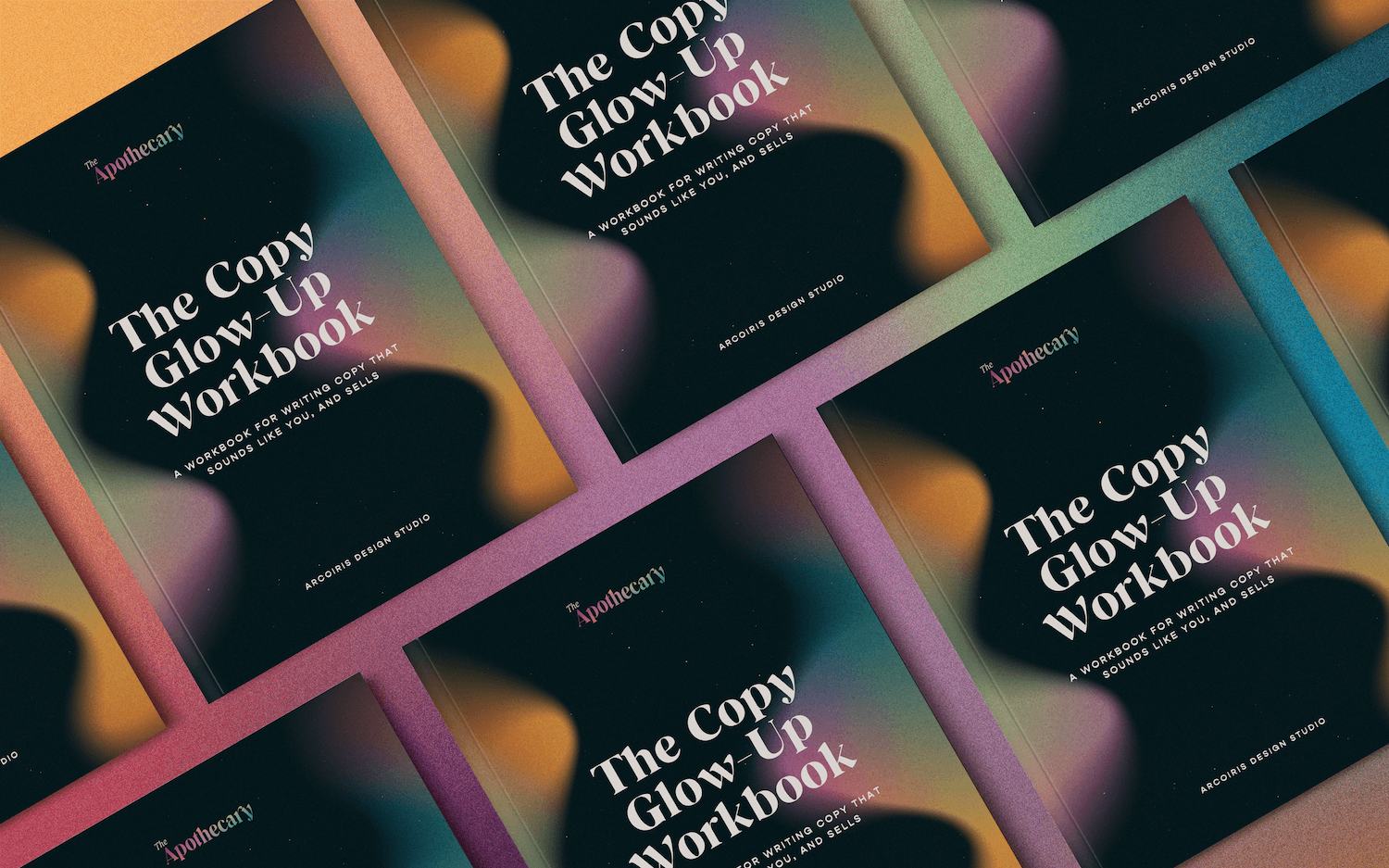
The Copy Glow-Up Workbook is a step-by-step workbook that walks you through every core website page with structured prompts, clear guidance, and AI prompts you can take straight into ChatGPT or Claude, if that’s a tool you’re open to using. Each section breaks down the exact structure your copy needs, the writing prompts to pull your voice out, and the strategic thinking behind why each element matters. The Copy Glow-Up gives you the structure to finally get it out of your head and onto the page: organized, clear, and ready to go.
Let’s Stay Connected
Explore My Services to learn more about branding and web design support.
Explore The Apothecary Shop for accessible brand tools and resources.
Subscribe to my Substack for ongoing deep dives on design, astrology, entrepreneurship and being a human in the modern world.