How I Design a Squarespace Website for a Psychic Medium
A Behind the Scenes Look at the Astre Astoundance Redesign
If you've ever wondered what it actually looks like to design a Squarespace website for a psychic medium, this post is for you. I'm taking you behind the scenes of one of my most meaningful long-term client relationships—a full website redesign for April of Astré Astoundance. April is a psychic medium and intuitive who has been part of the Arcoíris family since 2020.
This website redesign wasn't a brand new build. It was a semi-custom redesign that took an existing template from the Apothecary and rebuilt it around a client's established brand. And it's a great example of how I approach designing a Squarespace website when a client already has a brand identity they love, they just need a digital home worthy of it.
Here's exactly how I approached it and why every decision was intentional.
First, Understanding the Client and Her Audience
Before I design a Squarespace website for anyone, I start with the same question: what does this site actually need to do?
For April, the psychic medium and spiritual guide behind Astré Astoundance, the answer was clear. Her clients are open-minded, spiritually curious people seeking guidance, clarity, and connection, whether that's communing with loved ones who have passed, receiving messages from guides, or gaining insight into their path forward. When someone lands on a psychic medium's website ready to book a reading, nothing should get in their way.
That's the job. Everything else, the visuals, the structure, the copy, is in service of that single goal.
Choosing the Right Platform and Approach
Knowing how to design a Squarespace website starts with knowing whether Squarespace is even the right choice. For April it absolutely was. She was already on Squarespace and comfortable with it, so keeping her there was a natural decision. It meant there was no additional learning curve for her and no migration headaches. All we did was rebuild her site to serve her better on a platform that on its own was already working well for her.
For a psychic medium whose energy is fully focused on her readings and her clients, Squarespace's intuitive guardrails are a genuine asset. It's reliable, low-maintenance, and doesn't demand constant technical attention. April can focus on connecting people with spirit without worrying about the tech. That's exactly what a good platform should do.
Rather than starting from scratch, I took one of my existing Squarespace templates and redesigned it from the ground up around her established brand. The template provided the structural bones. The redesign transformed it into something completely and unmistakably hers.
Choosing the Right Template

Template selection is one of the most underrated parts of designing a Squarespace website. The wrong template creates unnecessary work. The right one gives you a head start.
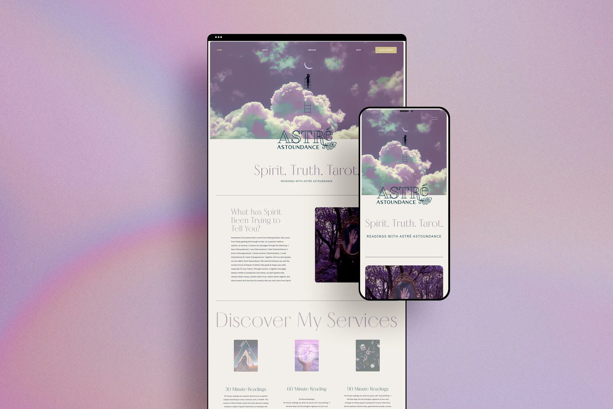
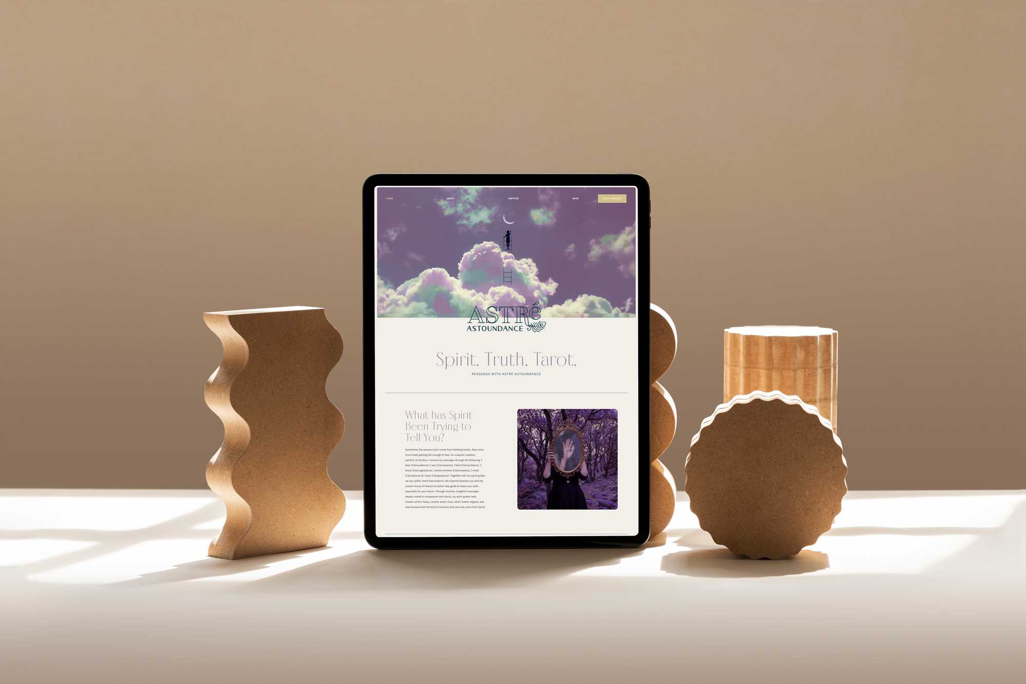
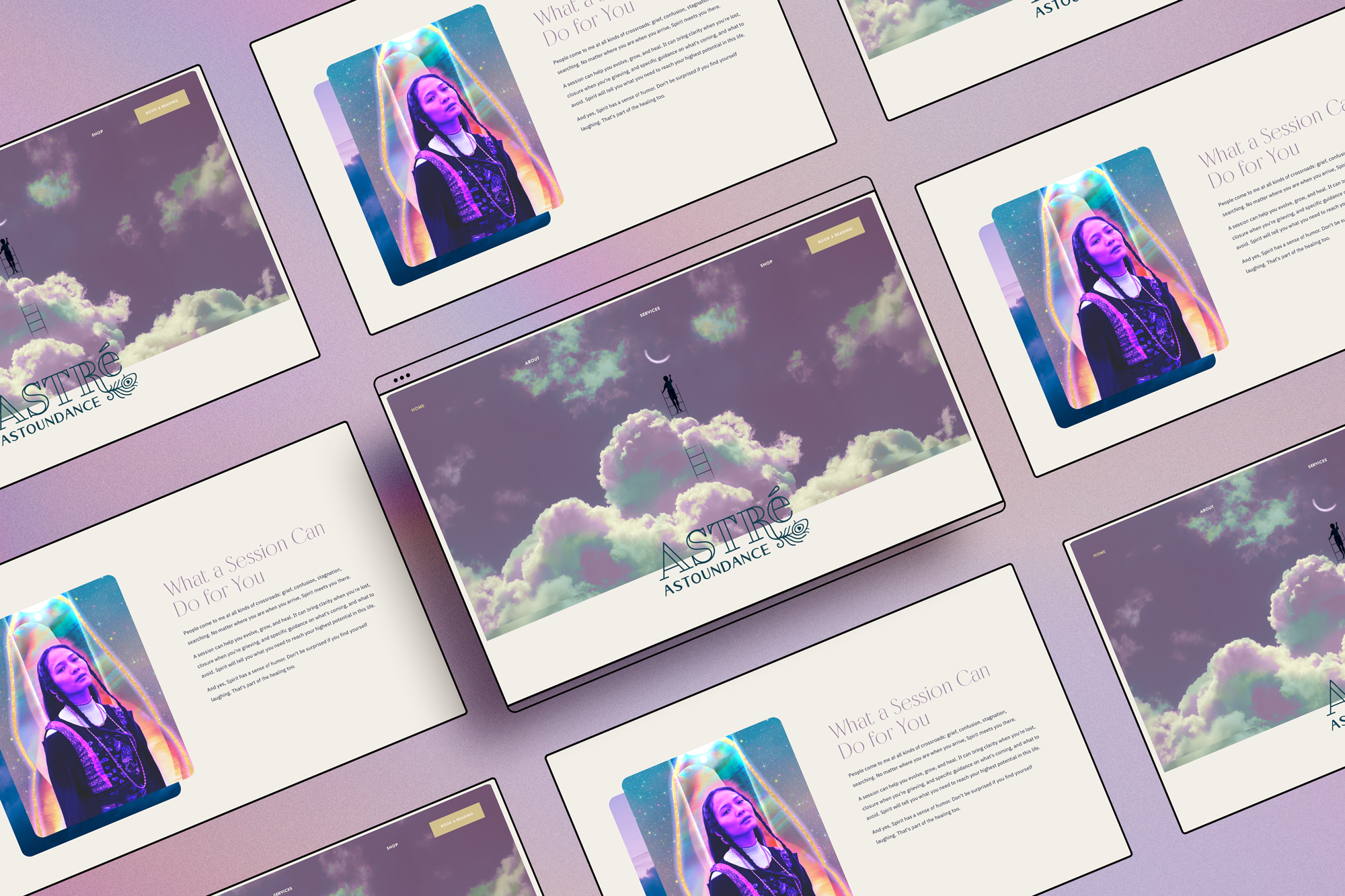
I design each of my Squarespace templates around the energy of its corresponding zodiac sign. April is a Taurus sun and deeply versed in astrology, so when I suggested the Taurus template we both immediately agreed. No deliberation needed.
The Taurus template is soft, intuitive, friendly, and inviting. These qualities mapped directly onto April's personality and the energy of Astré Astoundance. It was already energetically aligned with the brand she had built, which meant we could focus on the redesign itself rather than fighting against a template that wasn't a natural fit. Choosing the Taurus template allowed us avoid unnecessary complexity in the design process.
I intentionally steered away from something like the Capricorn template, for example, which would have required significantly more work to align with her existing aesthetic. For a psychic medium with an established brand, choosing an already-aligned template keeps the project focused on what actually matters: the client experience and the results.
Solving the Structural Problems
When I design a Squarespace website, structure always comes before aesthetics. A beautiful site that confuses visitors doesn't serve anyone.
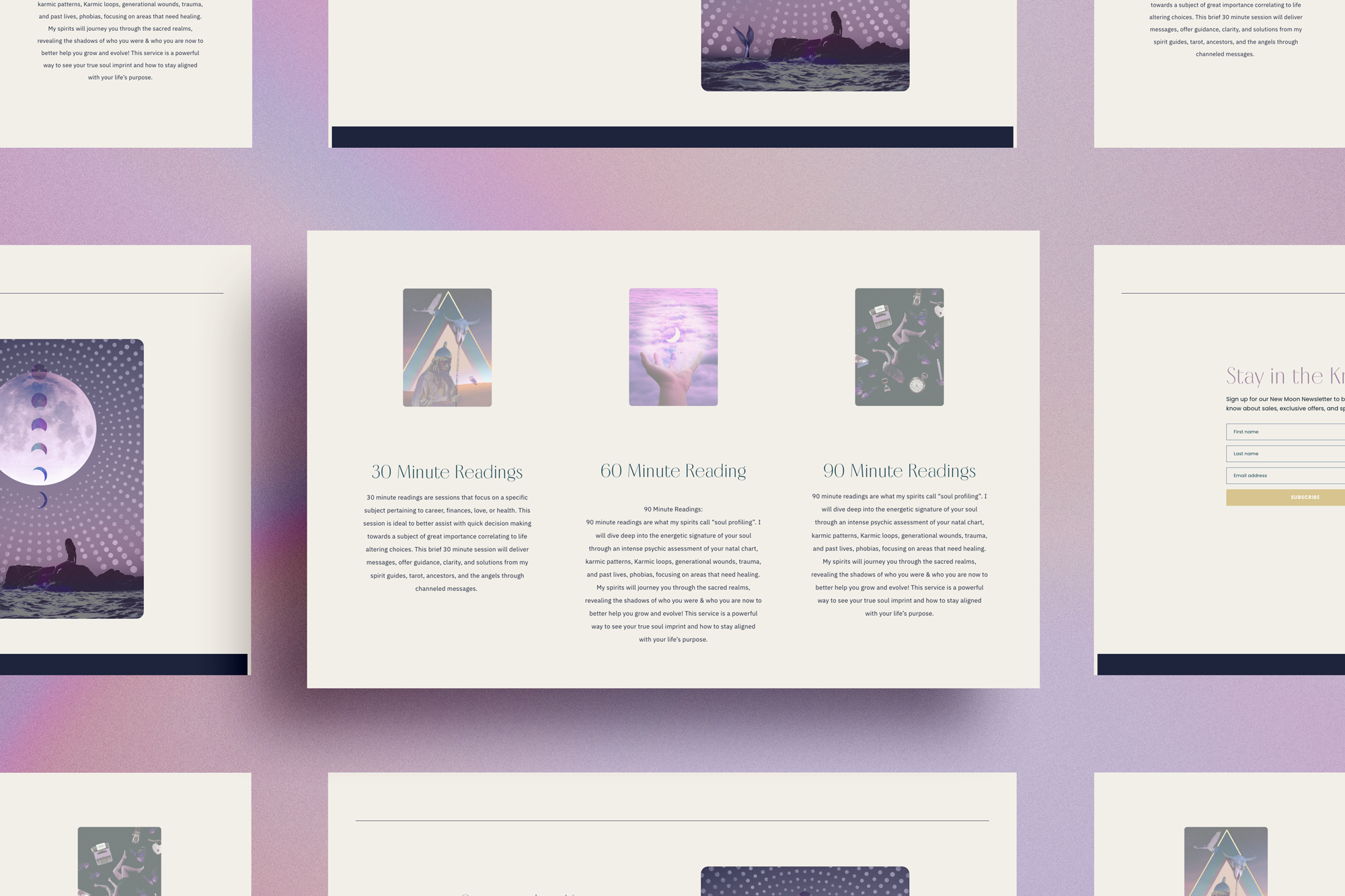
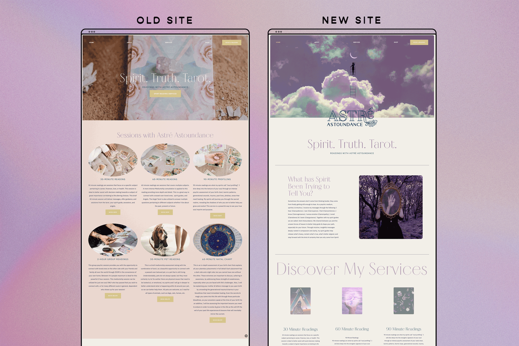
The old Astré Astoundance site had a real problem: too many pages, too many service options, and no clear path for a visitor to understand what to book or how to book it. When a potential client lands on a psychic medium's website ready to take the leap, confusion is the enemy. Every extra click, every unclear label, every buried booking link is an opportunity for them to close the tab and move on.
My job was to simplify. I streamlined the navigation down to what actually mattered, clarified the service offerings so clients could immediately understand their options, and made the booking process as frictionless as possible. April's practice runs on readings, so the site needed to make booking one as easy and automatic as possible, freeing her to focus entirely on her clients rather than the logistics of managing her calendar.
The Visual Strategy: Using the Spirit Oracle Deck
This is my favorite part of the whole project, and the detail that makes this redesign truly special.
One of the other projects April and I have collaborated on over the years is The Spirit Oracle, a tarot deck I designed for her. The deck's artwork is gorgeous: atmospheric, layered, deeply evocative of the spirit world a psychic medium works within every day.
So when it came time to redesign her website, I made a deliberate choice: instead of relying on generic stock photography, we would use The Spirit Oracle deck imagery throughout the site. Almost every visual on the site, with the exception of April's personal photos on the About page, comes directly from the deck.
The result is a site with a visual identity that is completely and unmistakably April's. There is nothing stock, nothing borrowed, nothing that could belong to anyone else. The deck imagery gives the site an editorial quality and a sense of cohesion that stock photos simply cannot achieve. And practically speaking, April had already invested in that artwork,- using it across her website meant getting the maximum possible value from work that already existed.
It's one of the smartest visual decisions I've made on a client project, and it's a principle I'd apply to any spiritual business with existing creative assets: use what you already have. Stock photos are a placeholder. Your own work is a statement.
The Result
When April saw the finished site, she cried happy tears.
That reaction tells you everything. A website that moves someone to tears is an accurate reflection of who they are and what they've built. After years of a site that didn't quite do her justice, April finally has a digital home that matches the depth, beauty, and specificity of her practice as a psychic medium.
The before and after speaks for itself: a flat, stock-heavy, hard-to-navigate DIY site versus a cohesive, atmospheric, easy-to-use redesign built entirely around her brand, her deck, and her identity.
And because the site is built on Squarespace with the guardrails that platform provides, April can focus on what she does best, connecting people with spirit, without worrying about the tech.
Working With a Designer Who Gets Your World
Knowing how to design a Squarespace website is one thing. Knowing how to design one that actually reflects who you are and serves your specific clients is another.
If you're a psychic medium, tarot reader, or spiritual practitioner with a website that doesn't feel like you, or worse, one that's making it harder for clients to find and book you, you don't need to start from scratch. You need someone who understands your world, knows how to translate it visually, and can build you something that finally works as hard as you do.
That's what I'm here for.
Let’s Stay Connected
Explore My Services to learn more about branding and web design support.
Explore The Apothecary Shop for accessible brand tools and resources.
Subscribe to my Substack for ongoing deep dives on design, astrology, entrepreneurship and being a human in the modern world.