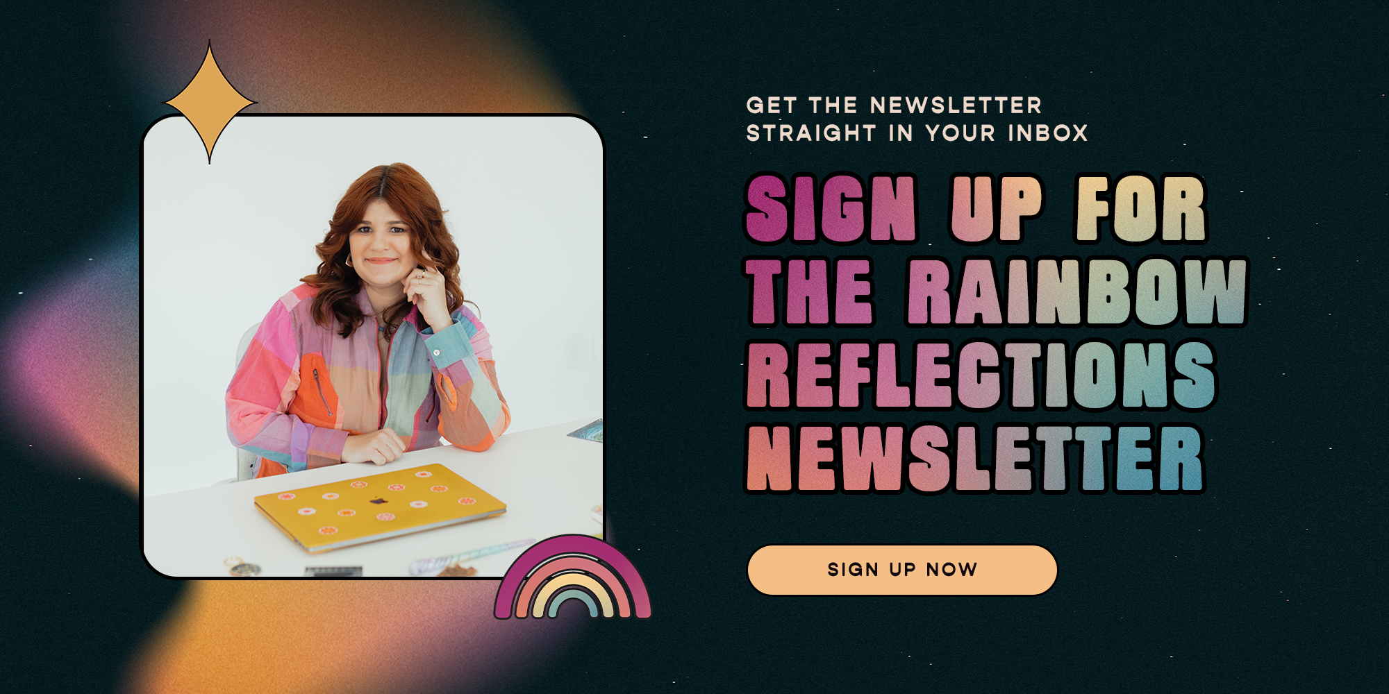
Brands I Birthed in 2025
A visual love letter to the souls I had the honor of designing with this past year.

This year, I returned again and again to a guiding belief: design is a ritual of resonance.
Not just aesthetics. Not just strategy.
But a ceremony, a process of listening, aligning, and becoming.
Each of these brands was born through that lens.
Collaborative. Intentional. Rooted in story and soul.
Whether you’re here gathering inspiration or dreaming up your own evolution, I hope this collection offers a spark of clarity, courage, or creative magic.
Balanced Bodywork, San Diego
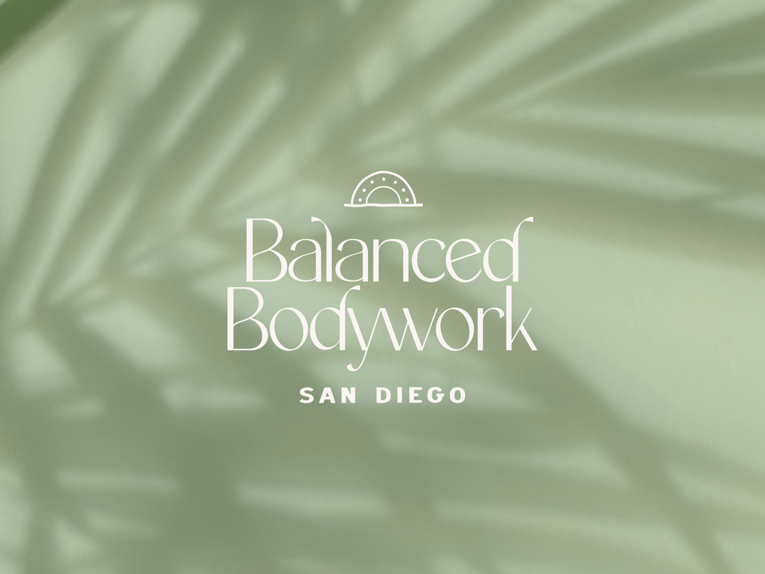
Lush and grounded. This brand was built for a bodyworker whose work feels like a deep exhale. We combined a refined, timeless font with subtle curved details to symbolize depth and flow. We also combined it with a more rustic illustration and subtitle font to symbolize the laidback nature of San Diego.
Realm of Intentions
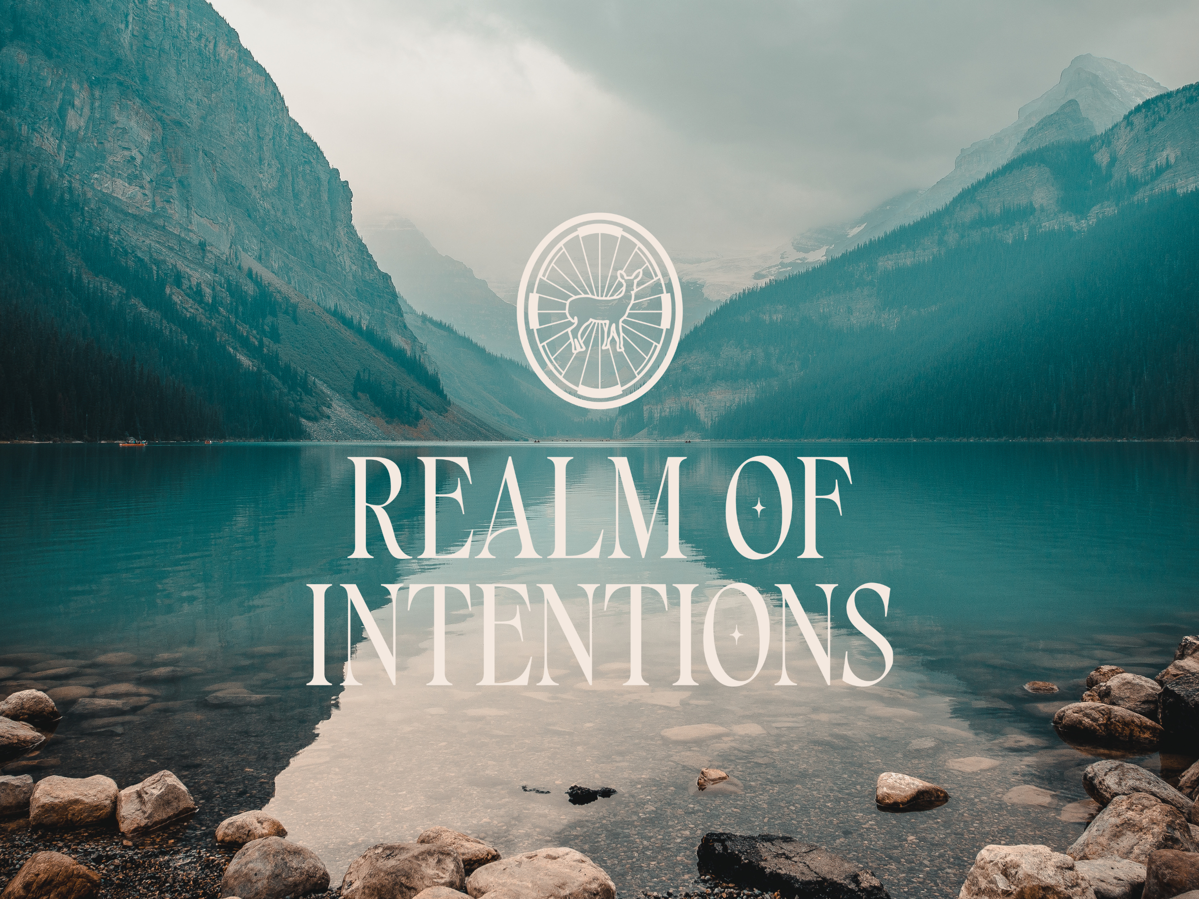
A brand like a ceremony. Rooted in ancestry, intention, and place, this identity blends sacred symbolism with spiritual clarity to create a sophisticated and refined logo.
Brunch With Purpose & Community
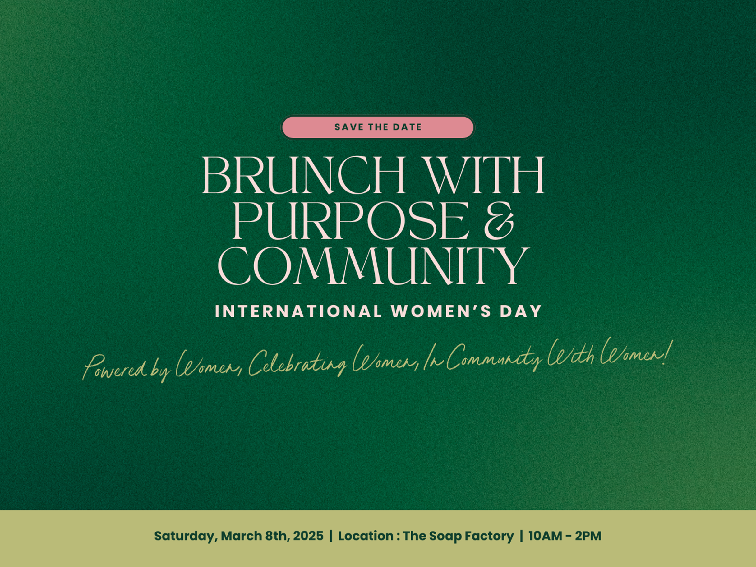
Made for International Women’s Day, this event identity was designed to facilitate a conference in San Diego. The bold yet feminine serif typography and forest green palette speak to feminine power, softness, and solidarity.
Sacred Perspectives
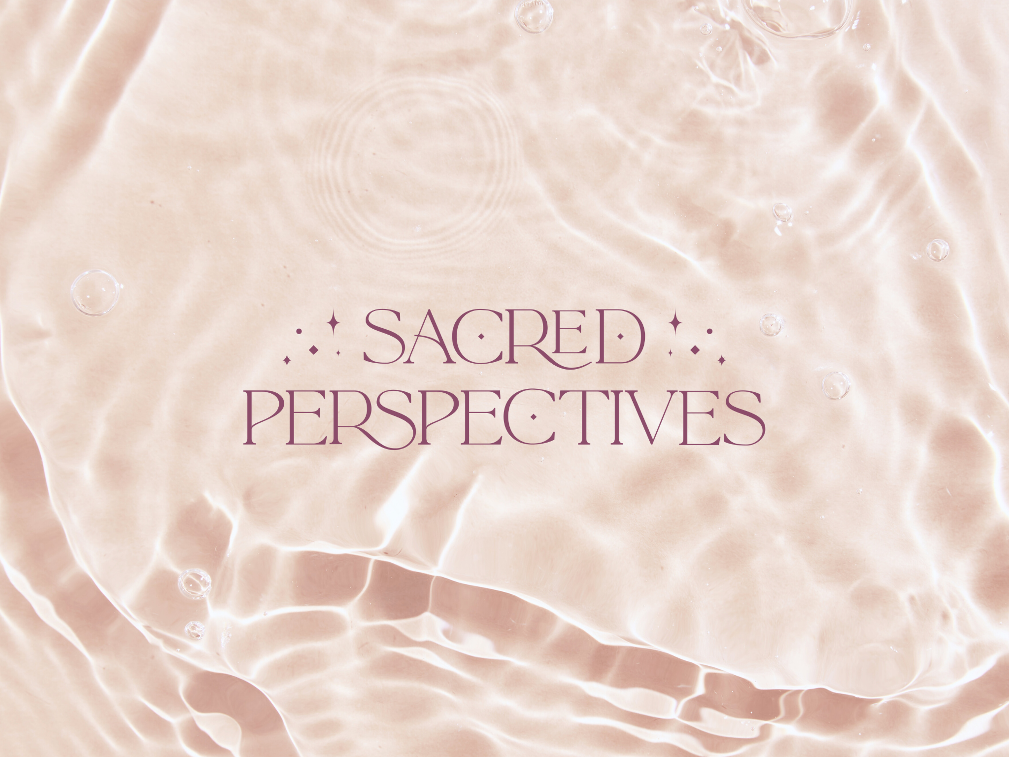
Like sunlight through water. This brand holds space for gentle transformation and intuitive clarity. With soft shimmer, spacious type, and a palette that feels like rose quartz in motion, Sacred Perspectives invites us to see the world, and ourselves, with sacred, softened eyes.
Up A Notch Abilities
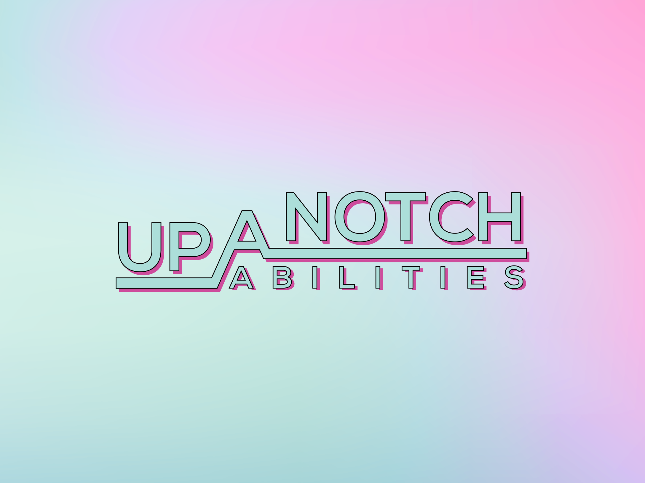
Playful, proud, and powerfully neurodivergent. This brand is a celebration of difference through color, movement, and joyful expression. Every detail was thoughtfully refined to prioritize accessibility, transforming inclusive design into a bold act of visibility, advocacy, and love.
Everything Unsaid
Minimal. Mysterious. Meant to hold silence with care. Created for connection and emotional alchemy, this brand leans into restraint, letting type and tone do the talking (and not-talking). A visual space where the unseen becomes sacred.
Glitter & Gravitas
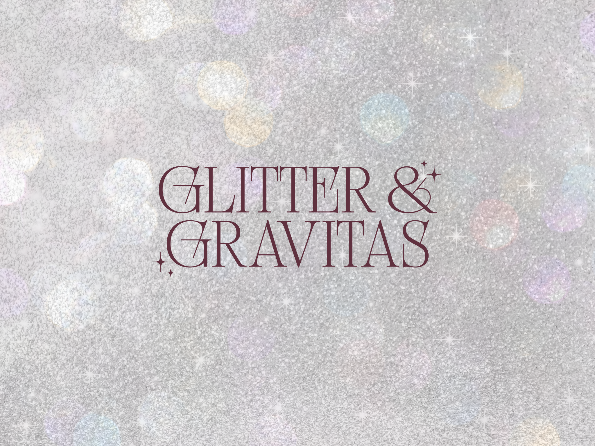
Designed for the multidimensional leader, one who sparkles and speaks with weight. The palette is deep. The vibe is elevated. The tone is “mystic CEO.” Every element is a reminder that professionalism and personal magic can coexist beautifully.
Joyful Birth, San Francisco

This brand bloomed through softness, story, and tradition. Inspired by vintage floral packaging and mid-century palettes, this birthkeeper’s brand evokes warmth, wisdom, and welcome, a visual doula for every piece of her work.
Cherry Luxury

A brand that winks with luxurious playfulness. Cherry red, custom script, bold curves. This identity oozes old-Hollywood confidence with a modern twist. Built for a creative who leads with both sweetness and sensuality.
Carlee Murrell Coaching
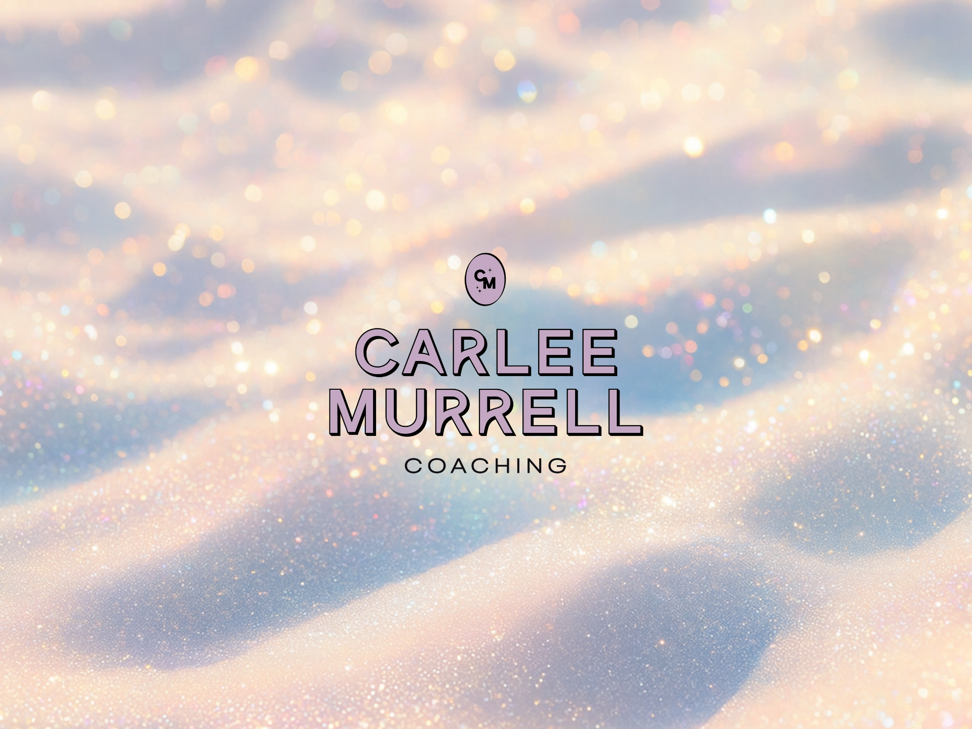
A subdued pastel cosmos for personal transformation. With soft sparkle, dreamy gradients, and strategic clarity, this brand helps Carlee’s coaching practice feel like a starlit invitation, to come home to your power, your softness, and your shine.
Reflections from the Studio
Each of these brands was an act of listening.
To the founder. To the essence. To the energy wanting to emerge.
Design as a ritual of resonance means we don’t just decorate your brand, we attune to it.
We co-create something that feels like truth in visual form.
It’s intuitive.
It’s strategic.
It’s magic made tangible.
Whether we worked together this year or you’re dreaming up your next evolution, thank you.
For trusting me with your vision. For believing in the power of beauty and meaning. For saying yes to resonance.
Ready to birth your brand in 2026?
Let’s co-create something that feels like you, and speaks to your people.
🌈 Book a call if you’re ready for 1:1 support.
Let’s Stay Connected
Explore The Apothecary Shop for accessible brand tools and resources.
Subscribe to my Substack for ongoing deep dives on design, astrology, entrepreneurship and being a human in the modern world.