Magnetic Branding & Web Design for a Embodiment Coach & Brand Stylist
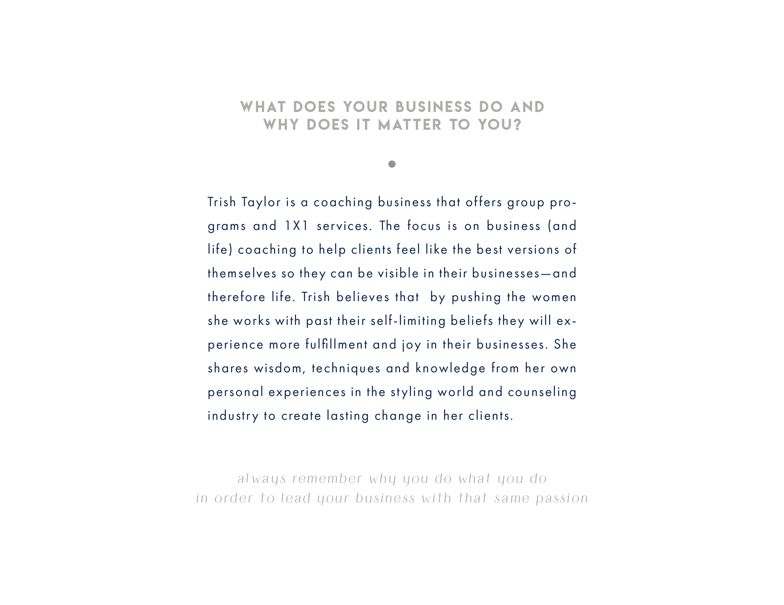
Trish Taylor is a magnetic brand stylist and embodiment coach for female online entrepreneurs. She combines her background in styling with empowerment coaching to help elevate the confidence of her clients. She wants her clients to feel good in their bodies, show up with radiant confidence online, and to magnetize dream clients of their own. She does this through a combination of coaching, styling work, photoshoot assistance, courses, and more.
Services
Brand Strategy
Visual Brand Design
Kajabi Web Design
The Mission
When Trish and I first connected, it was clear that her online visual presence did not match her radiant personality. Our goal through our work together was to match them up, through a variety of projects including branding, journal design, social media assistance and, finally, a website overhaul.
The Outcome
The longer Trish and I have worked together, the more embodied her brand becomes. We worked on a branding project that elevated her visuals and took her brand to the next level. From there, we transformed her website experience to create a truly magnetic experience on Kajabi.
The Impact
Trish has successfully launched a variety of course offerings since we started working together. Her branding has helped her feel more aligned with her business, helping her book more clients since her website is now an accurate representation of her brand.
Connected Via Social Media
Trish and I first connected because she came across my account on Instagram. She mentioned to me on our discovery call that she had actually been searching for an interior designer for her home when she searched intuitive designer on Instagram. Through this search, my account popped up and she felt immediately called to connect. Trish and I actually began our work together with a social media retainer. Trish was looking for support to create content for her Instagram account and I was happy to oblige. I set up a 3 month container for us to work in, and from there I built a variety of different designs for her based on her post specifications.


Brand Strategy
Through our social media retainer, it became clear to both of us that Trish’s entire brand needed an upgrade. The brand was visually very pretty, but it felt a bit flat. Trish expressed feeling disconnected from the brand, and I told her we should redesign her visuals to bring things into more alignment. Once we decided to move forward, it was clear that a major transformation was taking place.
During the strategy phase of Trish’s branding project, I realized there was a lot more playfulness and fun in Trish’s brand than was previously expressed. There was an opportunity to reflect on her qualities and values with more ease and do so without creating confusion through a disjointed visual brand experience.


Brand Design
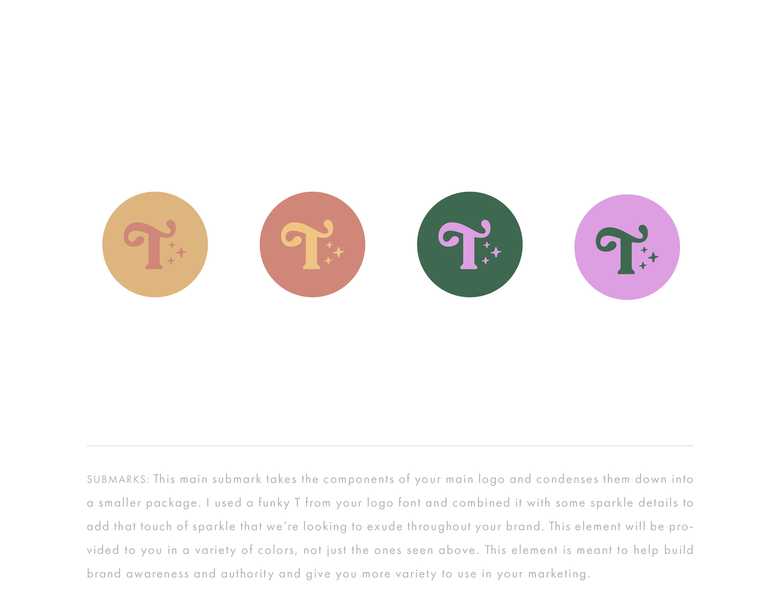
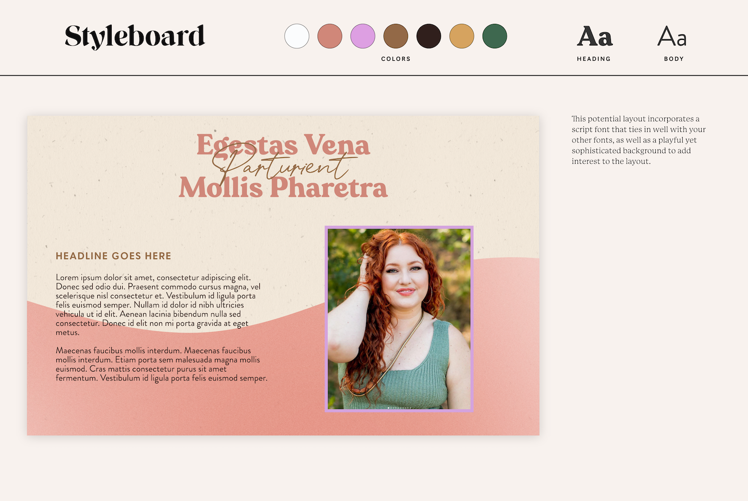
Our goal with Trish’s branding was to create a brand that is aspirational yet approachable. We wanted it to feel like an extension of Trish and her essence. We wanted the brand to be professional and polished while also highlighting her femininity and uniqueness. We used soft muted colors to reflect an elegant, refined yet inviting brand personality. We also shifted the font system for the brand to make it more impactful. Furthermore, her main logo is a fun typographic style, with a minimal supporting submark. This approach was taken to give Trish more freedom when applying the brand to your business. The brand is meant to attract Trish’s ideal clients and also stand out from her competitors so the business can grow for years to come.
Trish Taylor
Showcase


Website Strategy
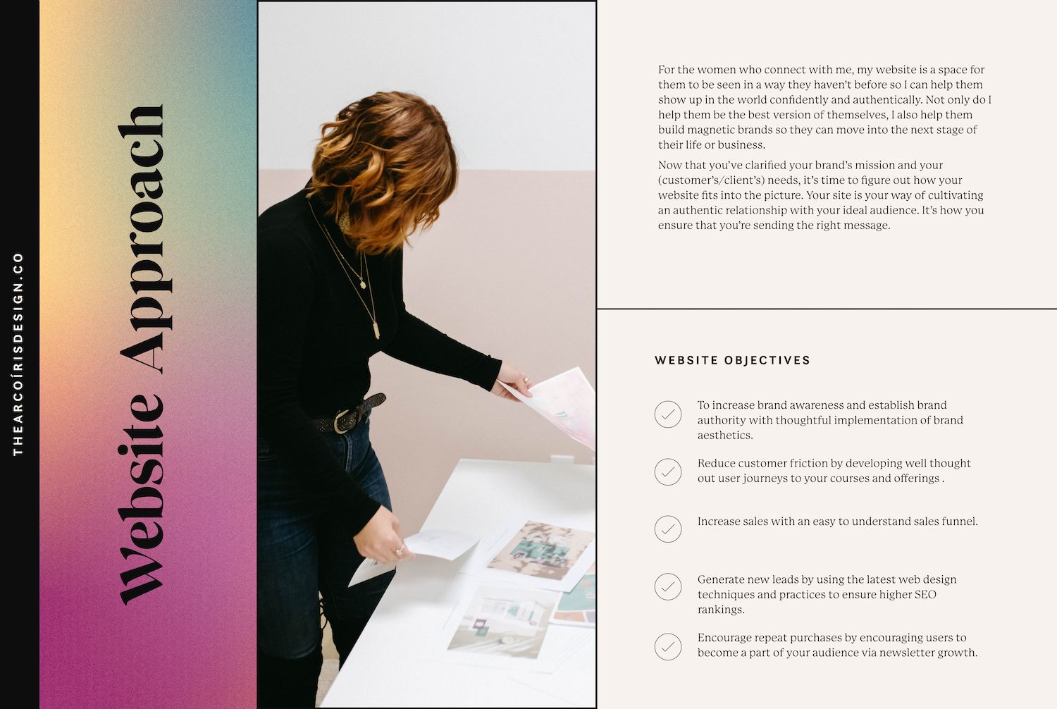
After sitting with her new branding for some time, Trish came back to me to transform her website and reimagine it. She had expressed wanting to create the site on Kajabi, but I was concerned at the time that we would not be able to translate the branding to its fullest capacity on the Kajabi platform so we went with Squarespace instead.
From there, we came up with a game plan to tackle the large undertaking for Trish’s site. She was looking to create a site with over 10+ pages, including several sales pages and a template for ease of use post-project. With the freedom I had using the Squarespace platform, I was able to dream up a truly unique and inviting website experience for Trish and her clients.

Front End Design
When I first connected with Trish, I noticed that her website was a bit bland. It was refined, clean, and technically well put together. But it lacked life. It didn’t have that spark of joy that you feel when you have a conversation with Trish. I knew that’s the feeling I wanted to evoke from the site when you landed on it. Since Trish is the front-facing figure in her brand, it was important for her website to take a direction that felt like it truly reflected her. I just wasn’t sure exactly how I’d make that happen.
I wanted the site to feel fluid and engaging, but still impactful and full of meaning. Ultimately, it was through a variety of different visual elements that I was able to encapsulate Trish’s brand messaging. I used a combination of stunning gradient backgrounds, unique brand illustrations, and gorgeous website videos and photography on Trish’s website. I played with the elements in a variety of ways to create unique website layouts and styles. I combined elements to create an organic, feminine feel for the site. I leaned into who Trish is as a person and personified that via her website. And I am blown away by how it turned out.

Platform Issues
We launched the site on Squarespace and we were both so happy with the design. Trish loved how I was able to create such a unique website experience for her on Squarespace, and I loved how I was able to build it in a templated way that would support continued website growth and transformation.
Eventually, though, we realized that Squarespace had some limitations. It was not as intuitive to use as Kajabi, and Trish was not able to edit her site as easily as we had hoped she would. We decided to then transfer the site we had built on Squarespace to Kajabi, keeping in mind that some functional details may be lost in the process, but doing our best to maintain the integrity of the initial design on the new platform.
This was an amazing turn of events for both of us because we found that the transfer to Kajabi was relatively seamless and easy. I was to find out that as a platform Kajabi had refined and updated their website builder in a way that allowed me to go in and customize it really well. I had used Kajabi previously on a project a few years prior and this was not the case at that time. Through this platform transition, I was able to discover that while Kajabi is not as advanced of a website builder as Squarespace by any means, it is much more advanced than I had thought prior to the project. I was able to rebuild most of Trish’s site on Kajabi with ease, with a few minor exceptions. This has opened up the possibility for me to work more regularly in the Kajabi builder.
For Trish, we were able to simplify the backend of her business. She already uses Kajabi to host her courses and market to her audience. With her website on Kajabi, we have consolidated her online presence into one backend platform. This makes running her business easier to manage and reduces costs as she is only paying for one platform to run her business as opposed to several.
When building her website on Squarespace, I created a templated website page that Trish could use over and over again for ease of use. When we moved to Kajabi, I rebuilt this template ensuring that the templated functionality was maintained on the new platform. The website page template I created is fully customizable and duplicatable in nature. It can be used for both regular website pages and sales pages as well. Trish has the ability to create new website pages with ease any time she needs to market her business in a new way.
Plus, I provided Trish with step-by-step video tutorials to make website changes on her own. I have built the site on Kajabi in a way that allows Trish to update her copy and her photography on her own, without me gatekeeping that information from her.

“ LOVE love loooooove the concepts you’ve created for my brand. They’re so cool!”
Ready to Get Started? ✸ Get in Touch Today ✸ Ready to Get Started? ✸ Get in Touch Today ✸ Ready to Get Started? ✸ Get in Touch Today ✸ Ready to Get Started? ✸ Get in Touch Today ✸ Ready to Get Started? ✸ Get in Touch Today ✸ Ready to Get Started? ✸ Get in Touch Today ✸ Ready to Get Started? ✸ Get in Touch Today ✸ Ready to Get Started? ✸ Get in Touch Today ✸ Ready to Get Started? ✸ Get in Touch Today ✸
Ready to Get Started? ✸ Get in Touch Today ✸ Ready to Get Started? ✸ Get in Touch Today ✸ Ready to Get Started? ✸ Get in Touch Today ✸ Ready to Get Started? ✸ Get in Touch Today ✸ Ready to Get Started? ✸ Get in Touch Today ✸ Ready to Get Started? ✸ Get in Touch Today ✸ Ready to Get Started? ✸ Get in Touch Today ✸ Ready to Get Started? ✸ Get in Touch Today ✸ Ready to Get Started? ✸ Get in Touch Today ✸

