Developing an Exalted Aesthetic for a Fashion Stylist
The Stylist Witch is an astrology-based fashion stylist brand run by Gabriela Rosales. She offers a variety of fashion services geared with a magical lens. From a closet clearout service to full-on photoshoot styling, Gabi has an offering for a variety of different clients. What sets Gabi apart is her unique approach to fashion. Her focus on astrology and color magic gives her an edge and make her a fashion witch. Her integration of Tarot into her services adds to that as well.
Services
Brand Expansion
Brand Support
Custom Web Design
The Mission
My goal at the Arcoíris Design Studio was to help Gabi design a website that worked with her and not against her. We wanted to increase her credibility as a service provider, allowing her to charge higher prices to those around her. Not only does she want to increase the number of clients she attracts, but she also wants to build a community around the occult. Plus, she wanted to make things as easy as possible for her clients to book her services.
The Outcome
I worked with Gabi to create a website that showcases the intuitive and spiritual approach toward fashion styling. I ensured that her website was functional while not sacrificing aesthetics that are oh-so-important to her. With a strong digital home, she is able to easily interact with clients and share her services with them outside of social media.
The Impact
Since the launch of Gabi’s website, she’s been able to increase her offers, increase her prices and showcase her expertise. She is more confident in her work and it shows. She is constantly expanding on her work and is going to be releasing a membership soon, which I also am helping her organize and bring to life.
Connected through Like-Minded Community
Gabi and I first connected through like-minded friends in the festival and astrology space. We had been following each other on social media for some time, and in 2020 we were drawn together to work on a website together.
Gabi was enamored by the intuitive approach I took to web design. It was unique at the time in my industry, and I was the only one I knew using that language. This unique perspective on design drew her to work with me on revamping her website. She didn’t want to get rid of the site she already had but wanted to revamp the design to reflect the growth she had as a professional in the fashion space. I was super excited to connect and work with Gabi because it felt like we had a similar approach to our work; we both incorporate spirituality and intuition into seemingly unrelated fields.
Website Strategy
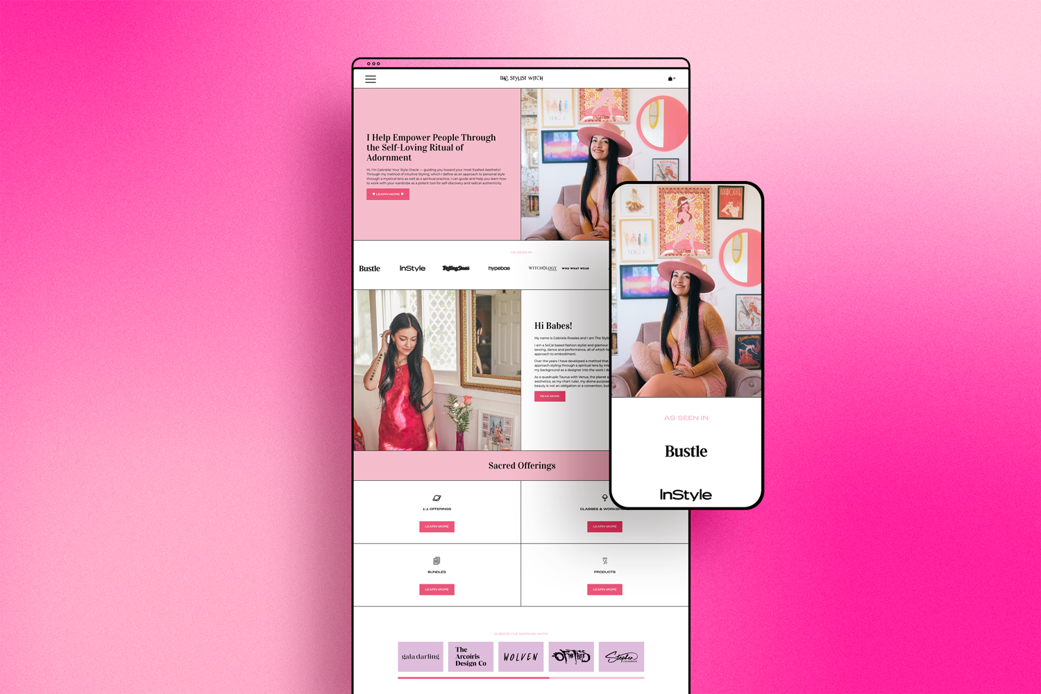
My main goal while working with Gabi was to reflect her unique personality through her website. From a visual standpoint, I wanted to take the parts of Gabi that stand out—her love of astrology, use of tarot, incorporation of deities into her work, and color magic—and showcase those front and center through her website.
Specifically, we used color magic to incorporate Gabi’s main brand colors into her design: pink and red. We kept those colors fairly minimal throughout the site, using them more as accents and pops of colors in places. Black and white were used more frequently throughout the design to make the site look and feel more high-end.
I also updated Gabi’s font system to make it more modern and reflective of her brand values. A serif font was chosen for her heading fonts to make her brand seem more established and build trust with her audience. We paired it with a more modern sans-serif font for the body copy to give the site an editorial vibe.The editorial vibe was further explored through the use of lines throughout the site. This subtle touch added elegance and refinement to an otherwise simple site design.

Form Meets Function in a Beautiful Way
On a functional standpoint, her previous site was difficult to use and navigate. The user experience was poor, which was leading to fewer bookings than she wanted. As a web designer, another goal I had was to simplify the navigation of the site and make it more engaging and fun to interact with. This is why I used a mega menu to create a more refined and elevated navigation experience. Furthermore, I wanted to ensure booking her services was easy to find and easy to do as well.
I achieved this goal in a variety of ways. Firstly, I created an engaging home page that showcases the most important information Gabi wanted her audience to interact with. From there, I reconfigured her services so they were easier to read, understand and book. We also set up forms on all of Gabi’s service listings to automate the process of getting information from clients prior to styling sessions. Finally, I updated her portfolio with custom functionality so it is fun to look through and highlights the variety of her styling work.

“MASSIVE thanks to my BRILLIANT web designer Alex who has helped me immensely with the task of making my brand cohesive (and cute AF). It has not been easy so I appreciate Alex for her patience and genuine support in helping me establish my most authentic brand presence. Seriously if you need a web designer...WORK WITH HER! ”
The Stylist Witch
Squarespace 7.0 Showcase


Brand Expansion
Since the launch of Gabi’s site, we’ve remained in a long-term working relationship. I have helped her with a variety of different branding-related projects. From flyers to gradient details for her brand, I’ve done it all. We’ve created logos for sub-brands, social media posts, and designed logos for products. We’ve expanded the brand exponentially, and it keeps getting better and better with time.


Website Updates for Usability
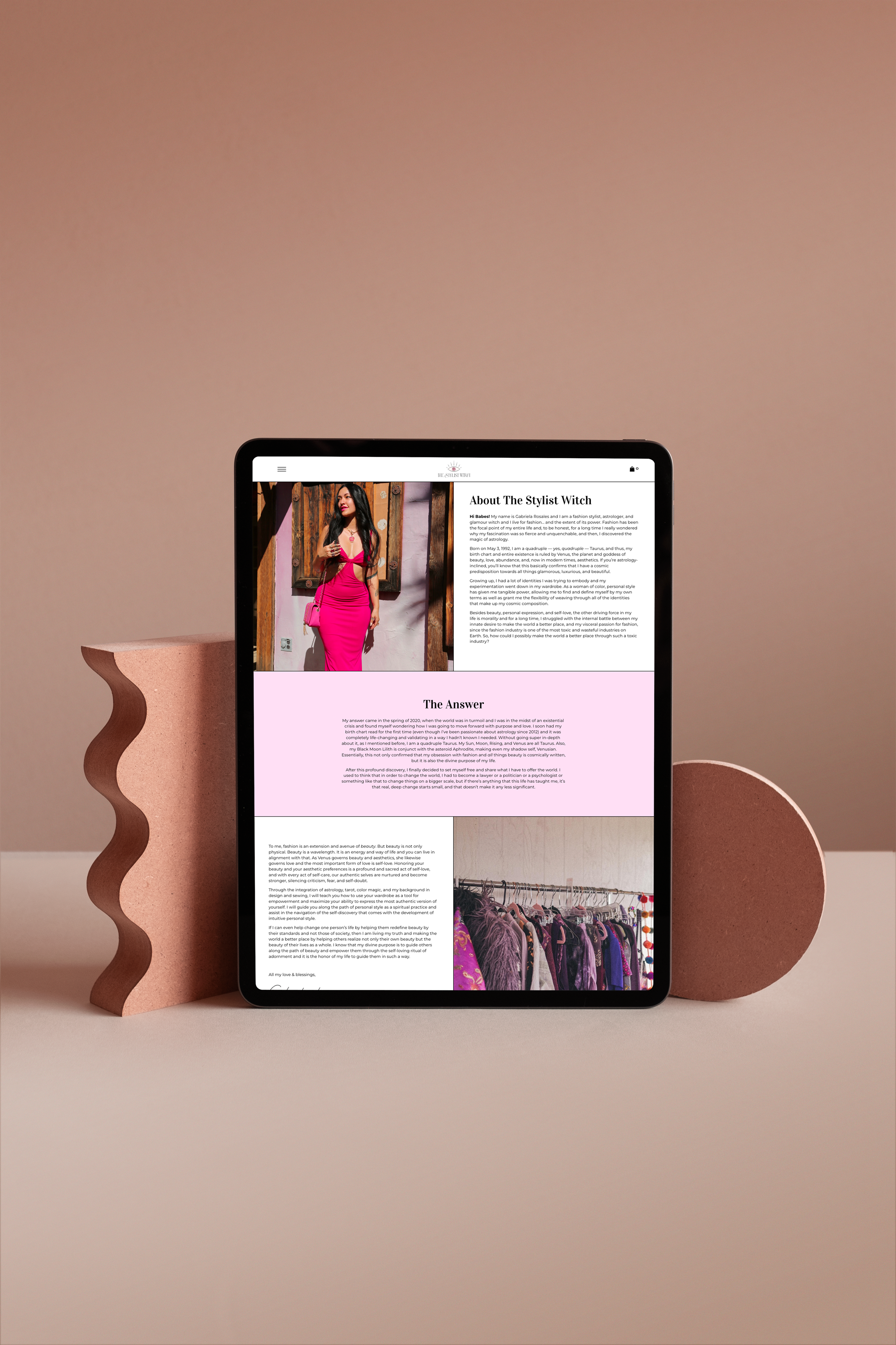
Gabi’s website turned out gorgeous and amazing. It has served her so well since we launched it. The thing is, we built her website using Squarespace 7.0, which at the time was the most up-to-date version of Squarespace. Since her launch at the beginning of 2021, Squarespace has released Squarespace 7.1 and Fluid Engine. This means that her site has increasingly become less and less up-to-date over time. Now, in 2023, her site is difficult to edit and barely functions on the backend. With this in mind, we decided we needed to update her site and bring it to a more current version of Squarespace.
Template Remix in Action
To keep things simple and cost-effective for Gabi, we opted for a Template Remix-style project to update her site. We used the Amilia template as a base and then customized it to fully transform it into her website. Our goal was to emulate the same design Gabi had previously because she still loved it. That being said, we did update some design details to reflect the shifts and changes that have taken place in her brand since 2020. This was simple and easy to do with a template as a base and I was able to fully redesign and launch the new site in under a week.
The Stylist Witch
Website Showcase


Branding Evolution: Crafting Elegance with a Touch of Mystique
In my continued collaboration with The Stylist Witch, we've elevated the branding to embody a fusion of luxury and mystical allure. This transformation wasn't just a redesign; it was a rebirth. Gabi’s goal with her rebrand is to attract higher paying and more elevated clients. My goal was to represent that client need visually.
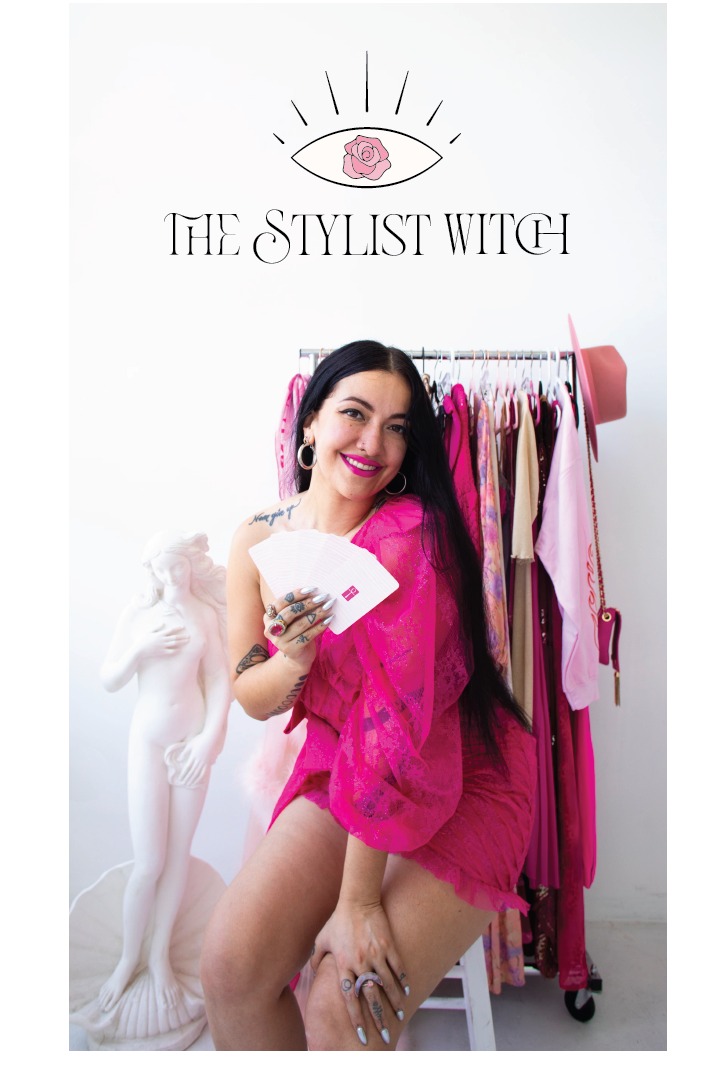
For the refined color palette, we embraced a symphony of light pink, white, black, and beige. These hues were meticulously chosen to envelop The Stylist Witch's brand in an aura of luxury and refinement, balancing the soft femininity of light pink with the timeless elegance of black and white, and grounding everything with the warmth of elegant beige. This carefully curated palette reflects a sophisticated yet mystical vibe, perfectly aligning with the brand's unique identity.
Typography was refined to marry elegance with clarity, choosing fonts that echoed the sophistication of a timeless, editorial serif with the modernity of sans-serif, mirroring The Stylist Witch's unique blend of tradition and contemporary style.
A logo for Long-lasting Legacy
In refining the logo, we intricately wove Venusian iconography into its design, incorporating the rose as a symbol of devotion to Venus. This choice not only pays homage to the goddess of love and beauty but also ties the brand deeply to the principles of beauty and aesthetic allure. Additionally, the use of an eye as the central symbol reflects the concept that fashion serves as a mirror to the soul, a tool for self-discovery and expression. This thoughtful inclusion of symbols enhances the logo's narrative, blending mystical elements with a profound message about the transformative power of fashion.
These enhancements are not merely aesthetic but echo the brand's core mission: to blend the mystical with the luxurious, offering clients a unique journey into the world of astrology-based fashion styling. Our journey with The Stylist Witch continues to unfold, each step an exploration of how luxury and mystique can not only coexist but flourish together.
The Stylist Witch
Brand Update Showcase


Kind Words from Gabi
“I have been working with Alex for years now and she truly just gets better and better! Alex built me the website of my dreams back in 2020 and back then the process was fun, creative, and stress-free. Fast forward to my website revamp in 2023 and I barely even had to guide her through the updates I wanted because she is so intuitively connected to my brand. Alex can not only make your website as functional as possible for your specific needs, but she also makes it PRETTY! Work with her immediately!!!”
Ready to Get Started? ✸ Get in Touch Today ✸ Ready to Get Started? ✸ Get in Touch Today ✸ Ready to Get Started? ✸ Get in Touch Today ✸ Ready to Get Started? ✸ Get in Touch Today ✸ Ready to Get Started? ✸ Get in Touch Today ✸ Ready to Get Started? ✸ Get in Touch Today ✸ Ready to Get Started? ✸ Get in Touch Today ✸ Ready to Get Started? ✸ Get in Touch Today ✸ Ready to Get Started? ✸ Get in Touch Today ✸
Ready to Get Started? ✸ Get in Touch Today ✸ Ready to Get Started? ✸ Get in Touch Today ✸ Ready to Get Started? ✸ Get in Touch Today ✸ Ready to Get Started? ✸ Get in Touch Today ✸ Ready to Get Started? ✸ Get in Touch Today ✸ Ready to Get Started? ✸ Get in Touch Today ✸ Ready to Get Started? ✸ Get in Touch Today ✸ Ready to Get Started? ✸ Get in Touch Today ✸ Ready to Get Started? ✸ Get in Touch Today ✸


