
Business Growth and Streamlining through Focused Brand & Web Design
Natalie Brite is a conscious business mentor and leadership professional. She teaches change-makers, earth-centered visionaries, conscious entrepreneurs, and creative business owners how to create their own custom channel for their creative gifts to flow from. She wants her clients to be able to come into alignment with the truest expression of themselves, do work they love, create purposeful profits, and impact the world in a revolutionary way.
Services
Visual Brand Design
Squarespace Web Design
Print Design
Squarespace Template Remix
The Mission
The world is changing. We are in a world dealing with late-stage capitalism, environmental collapse, racial disparity, and more. All of this while dealing with the difficulty of living in a world where social media usage is the norm (and encouraged by those corporations.) People want to gain control over their lives and positively impact these causes while also maintaining a happy life. It's all about finding balance in an increasingly online world riddled with problems. My goal at The Arcoíris Design Studio was to give Natalie Brite a platform outside of social media to spread her ideas freely without censorship and reach a broader audience.
The Outcome
I designed logos for Natalie Brite's business to round out the striking visual identity she had already developed. From there, I took this identity and transformed it into an easy-to-use website that could serve as the hub for Natalie Brite's online communication with her audience.
The Impact
Since the launch of her website, Natalie Brite has been able to attract incredible business opportunities, clients and partnerships due to her strong search engine visibility which drives organic traffic to her business.
Connected Through Community
I first became aware of Natalie Brite through a friend of mine. She shared that she has done a mentoring session with Natalie and was blown away by her approach to business. She encouraged me to give her a follow on Instagram and become acquainted with her as well since I am a business owner as well. After a few months of reading Natalie's content on social media, I knew she was my type of person. I joined her Align & Flow Membership in January 2019 and have been a member ever since.
Through Natalie's Align & Flow Membership I became more and more acquainted with her as a person through regular connection online. I loved the community and the content I was a receiving in the membership so that became my go-to place to hang out on the internet at that time. When she put out a call for a designer to join her team a few months later, I immediately jumped on the opportunity. I knew that I could support her in the way she was looking. Plus, I knew we would totally get along as people. Luckily for me she decided to move forward with me as her designer and we started a retainer partnership after that.
When I first started working with Natalie, I started by offering graphic design support. Natalie had expressed wanting to be a little more hands off with the images she produced for her business—which is where I came in. Together, we worked through different design briefs and created imagery that would support the content she was looking to create for her various online channels (IG, Facebook, Teachable, etc.)
One of the things we worked on at this time was logos for various channels in her business.


Brand Design
Natalie has two main components to her business. The first is the business itself, Natalie Brite as a whole. She also has The School of Conscious Leadership, which houses all her online courses and Align & Flow Membership. She expressed wanting to create logos for each of these brands.
When approaching this brief, my first thought was how could I create two logos that are related but also different at the same time? What I decided was to lean back on strategy and allow Natalie to share with me herself what she wanted to see in her logos. I had her work through my Brand Strategy Questionnaire and her answers in that document were illuminating. We decided that a symbolic logo would be best for Natalie's brand. It was meant to be playful and fun yet timeless and modern at the same time. We wanted to convey that the business was spiritual in nature and vastly different from its competitors.
I decided to move forward with a portal as the main symbol for The School of Conscious Leadership logo. It denotes all the different teaching and offerings Natalie has in her school. I also used eye imagery to represent vision and expanded consciousness. I added a sun to represent strength and ambition as well. Plus, soft waves were incorporated to denote femininity and make the logo a bit softer. Finally, I used a quirky sans serif font to add that modern touch really rounding out the logo design.


Additional Logo
I took the same approach with the main logo for Natalie Brite as well. I kept the same scene I had created in The School of Consciousness Leadership logo with the eye, sun, and waves. From there, I made the logo circular to symbolize possibilities. Instead of creating a simple border, I added a snake to the outside of this logo as well. Snakes represent strength, transformation and possibility so it was a no-brainer to add it to this logo.
Ultimately, the two logos are similar enough to look cohesive as elements in the same brand, but different enough to ensure clear recognition of the different aspects of the business that they represent.
With these foundational elements in place, we then decided to move forward with a new website for Natalie's business.
WITH THESE FOUNDATIONAL ELEMENTS IN PLACE, WE THEN DECIDED TO MOVE FORWARD WITH A NEW WEBSITE FOR NATALIE'S BUSINESS.
Website Design
The reason I moved Natalie over to Squarespace was the simplicity and ease-of-use the platform allows for. Squarespace does not offer limitations to developers while also making it easy for non-designers to use the platform as well. In order to achieve the striking visual design we wanted to create, we needed to find that balance in a platform. Furthermore, the site still integrated well with Kajabi so she was still able to obtain the functionality she was looking for.
Front-End Design
Natalie's original website design was very flowy in nature. My goal when designing the first iteration of the website was for it not to look like a website. I used paper elements and a variety of her brand elements throughout the site to create texture and visual interest in the site. I also used a variety of brand imagery we had created throughout our work together previously to make the site really pop. Natalie loved the design we went with and from there I started building this striking design with a unique visual experience.
Upon first building Natalie's site, I built it in a way that was slightly difficult for her to use. If you look at the mockup to the right, you'll notice my original design included various decor images scattered throughout the page to create visual interest and depth. The way I originally implemented these elements made the backend of her site a bit more difficult to manage. It wasn't impossible, but it wasn't totally intuitive either.

Website Usability
The way I left her backend never sat right with me. As my knowledge grew and I became a better developer, I learned ways in order to simplify Natalie's backend and make the site even more functional for her. Since I knew I could make things even easier than I had before, I reached out to Natalie and asked her if I could edit her site (free of charge) and update the way those images were implemented on her site to make her backend easier to use. With her blessing, I went back into the site and edited all her decor images using pseudo-elements. This code update made her backend work seamlessly again and made her site even easier to use than before.
“Alex is a JOY to work with. She has supported me with an entire website rebuild that was quite intensive and, at times, quite complicated. She helped ease so many stressful aspects of the build-out, including going above and beyond with ensuring that all of the technical components of my site were properly set up. Her design work is both visually beautiful and extremely high quality. She is awesome at communicating with clients + executing her client’s vision. I highly recommend Alex!”
Powerful Control for Non-Designers
At the same time, we were updating her decor imagery, Natalie and I decided to update the background images on her site as well. She had been working through an update to her visual branding, and we implemented that new direction on the site by updating her website backgrounds. This was a cost-effective way for Natalie to change the look and feel of her website with minimal effort. After implementing these changes for her, I also gave her a tutorial lesson on how to update these elements herself to empower her to start making changes to her website herself.
To learn more about other simple ways you can update your website yourself, check out this blog!

Out With the Old, In With the New
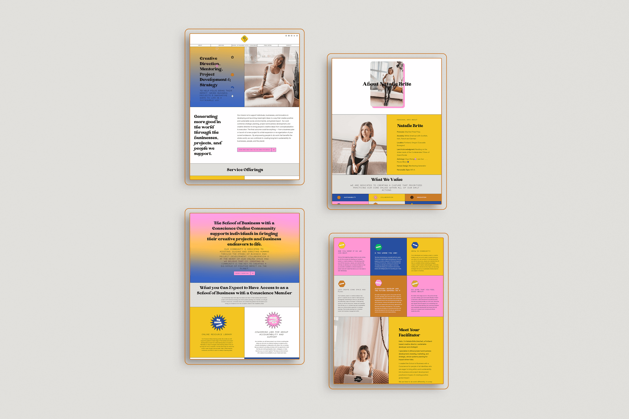
Natalie and I started working together on a 1:1 capacity in June of 2021. One of my big goals with her moving into our coaching container was designing creative and fun Squarespace website templates for 7.1. After putting together the design for my Amilia Template, Natalie expressed her desire to shift over her current site to my new design. There were a few reasons we decided to make this shift:
I originally built Natalie’s site on Squarespace 7.0, and she was ready to make the shift to 7.1, which is Squarespace’s most up-to-date version of the platform.
Natalie was empowered to make customizations to her website on her own post-launch, but this led to UX issues which created confusing user journeys across her 7.0 website.
Natalie’s branding had a refresh and she was eager to implement it on an updated website.
Template Remix in Action
In the span of 1 week, I was able to work closely with Natalie to get her site moved over to the Amilia template. The process of this shift started with us getting together for a 90 minute strategy meeting, where we went through each page of the Amilia template and determined how the sections of her old site would fit in the template design. We also discussed design customizations and how we were going to implement her branding to the template as well. Then, from there, I fully developed the home page for Natalie and let her review it. Upon approval, I developed the rest of the pages, went through a revision process and then finalized the design. The final piece of the puzzle was to rebuild Natalie’s Acuity scheduling account so it was integrated seamlessly with her website. After 5 days of work, we were able to launch her new site with ease.
To learn more about whether a Template Remix is right for you, check out this blog!

Amilia Template vs Natalie Brite Website


A Complete Biz Transformation
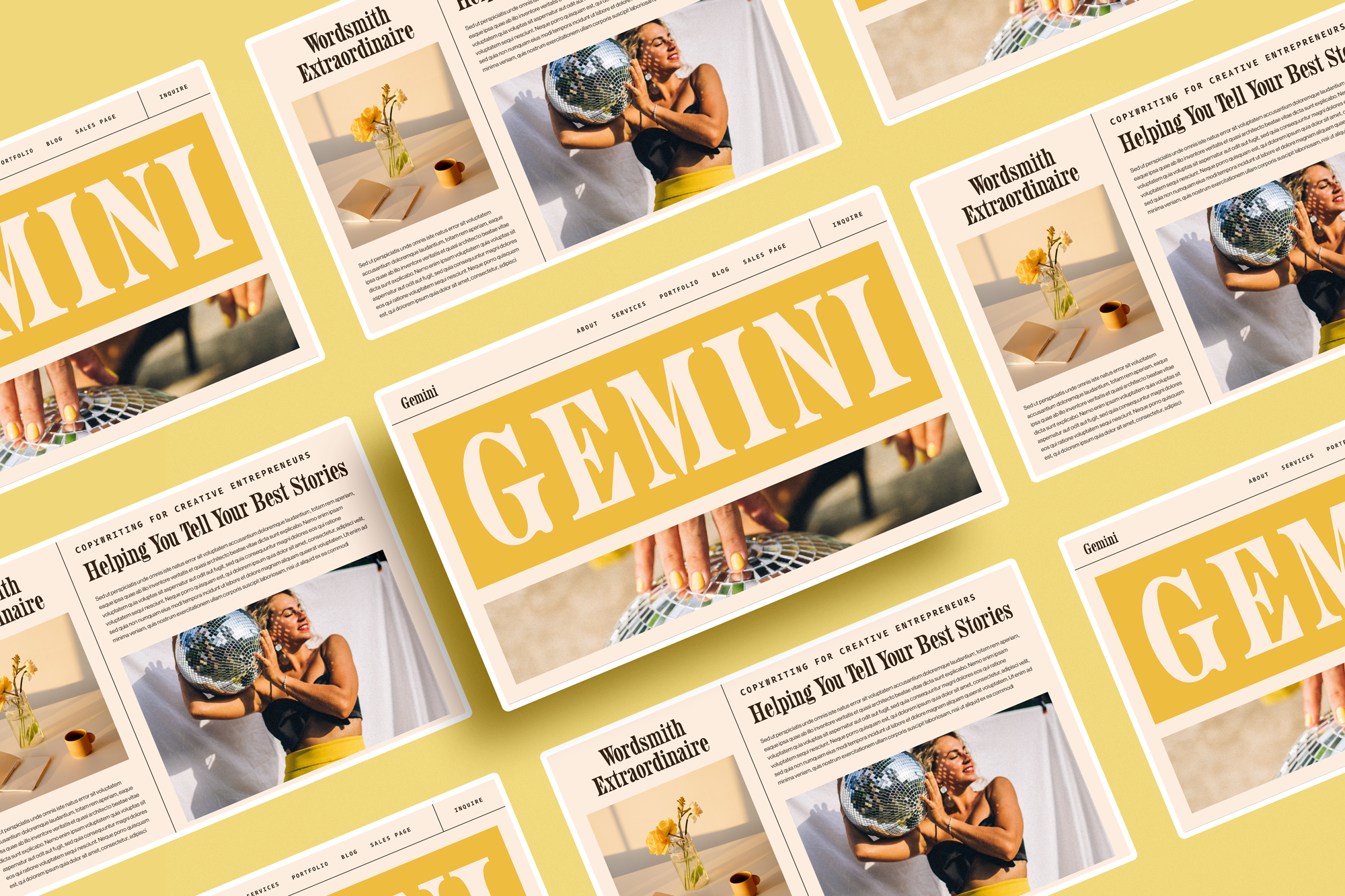
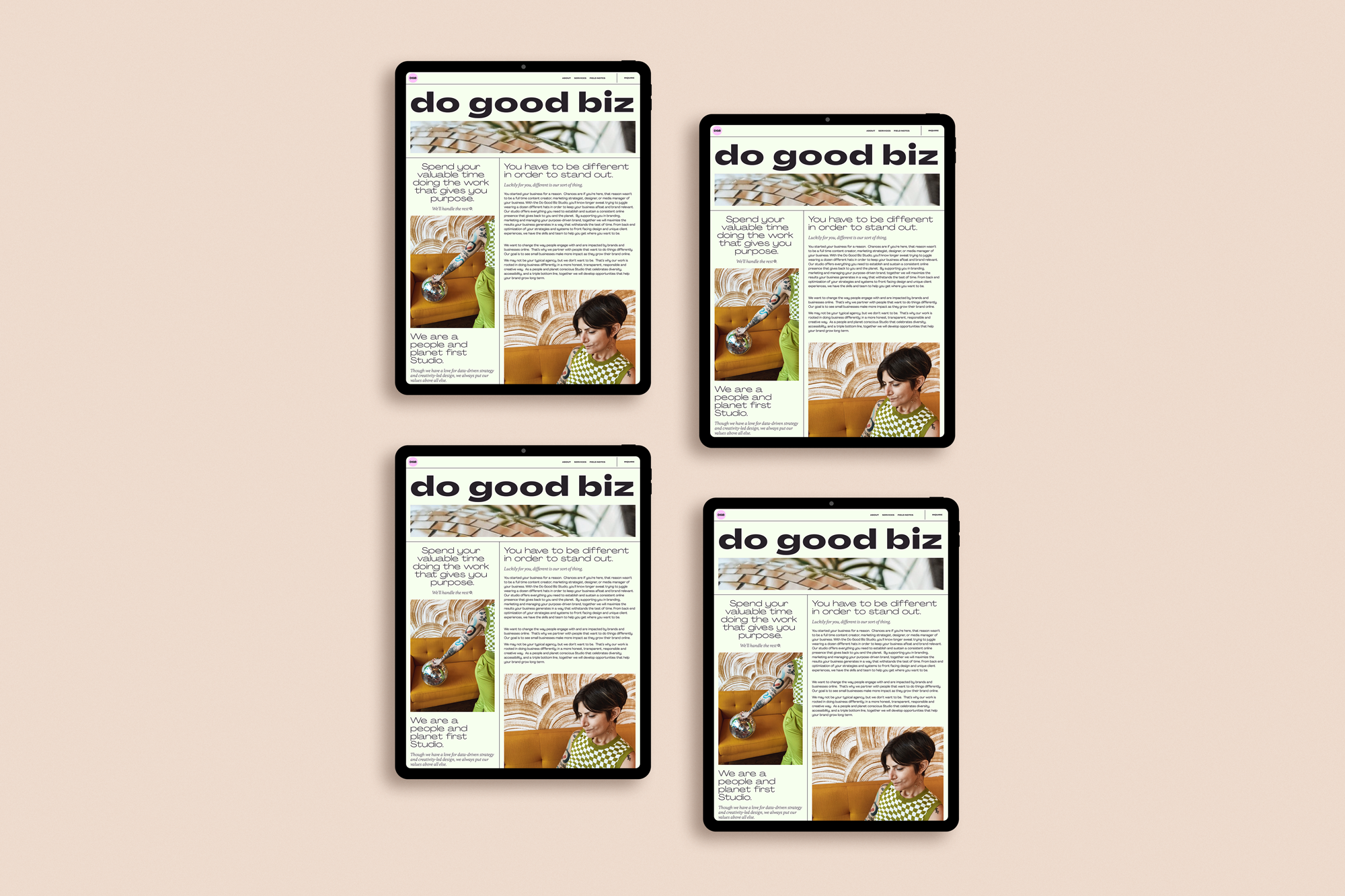
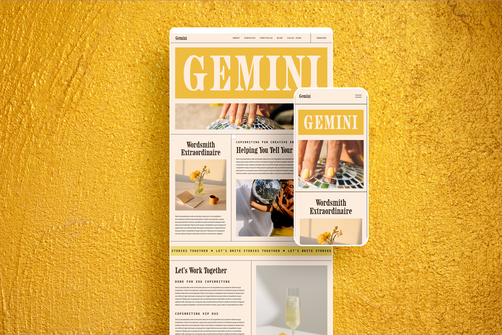
One of the beautiful things about building rapport with my clients is being able to work with them again and again as their businesses evolve and change. Natalie went through a complete business transformation in 2021, which led her to shift into an agency model branding business called Do Good Studio. With this shift there became an obvious need to update her website again. Plus, after working with an SEO specialist, Natalie was given some specific directions as to how to update her website so it would improve her search rankings. With this in mind we decided to move her from the Amilia Template to the Gemini Template, which will better serve her brand moving forward.
Simplified Template Remix
Another amazing thing about working with repeat clients is their familiarity with the platforms I use. Natalie is already super familiar with Squarespace, so we were able to create a custom Template Remix project for her where I mainly provided support and she handled the bulk of the remix herself. She implemented all the content and photos into her site, while relying on me to get her branding implemented just right, and providing additional coding support as needed. This not only saved me time, but also saved her money. A win win for us both! By working together, we were able to get her site fully transferred and completed in just over a weeks time.

Gemini Template vs Do Good Biz Studio Website



““Supporting Alex with her business allowed me to see firsthand what she was putting into the development of her Squarespace templates. Mentoring Alex through the build-out and launch of her templates initiated my desire to have her remix my website with one of them because I was so impressed with the intention she put into designing them, the quality, and the awesome customization abilities. I had just gone through a pretty big rebrand of the aesthetics of my own business and was eager to use one of Alex’s templates to solidify the changes. Since I had worked with Alex in the past, I knew I was in good hands and that she would have no problem executing my vision. Going through the website remix process with Alex far exceeded any expectations I may have had. It was the most smooth and seamless process ever, and actually a ton of fun! I was shocked at how quickly Alex was able to get the template set up and she was so incredibly responsive the entire way. Our communication throughout the journey was spectacular and she has no problem taking my ideas and executing them onto the website in exactly the way I had hoped. Alex was able to add some customization to the template we chose so to really make my brand pop! My website looks completely different from the original template and it’s so easy for me to go into my website and edit things on my own. My favorite part about working with Alex is that she not only can produce the types of aesthetics and designs I’m looking for in a creative way, but she also has a practical eye and skill for the technical. Combining these two abilities, I can always trust that she not only will deliver something visually beautiful but also functional and practical! I can’t say enough about how great of an experience it was going through the website remix process together. My website is a million times better in so many different ways because of it!”
”
Ready to Get Started? ✸ Get in Touch Today ✸ Ready to Get Started? ✸ Get in Touch Today ✸ Ready to Get Started? ✸ Get in Touch Today ✸ Ready to Get Started? ✸ Get in Touch Today ✸ Ready to Get Started? ✸ Get in Touch Today ✸ Ready to Get Started? ✸ Get in Touch Today ✸ Ready to Get Started? ✸ Get in Touch Today ✸ Ready to Get Started? ✸ Get in Touch Today ✸ Ready to Get Started? ✸ Get in Touch Today ✸
Ready to Get Started? ✸ Get in Touch Today ✸ Ready to Get Started? ✸ Get in Touch Today ✸ Ready to Get Started? ✸ Get in Touch Today ✸ Ready to Get Started? ✸ Get in Touch Today ✸ Ready to Get Started? ✸ Get in Touch Today ✸ Ready to Get Started? ✸ Get in Touch Today ✸ Ready to Get Started? ✸ Get in Touch Today ✸ Ready to Get Started? ✸ Get in Touch Today ✸ Ready to Get Started? ✸ Get in Touch Today ✸

