Tools for Color Psychology

As many of you know at this point, I got a bachelor of science in human biology. During that time I also minored in cognitive science, meaning I spent a lot of time studying about the brain. One of the key takeaways from that time is our brain is literally wired to process visual stimuli. It processes visual information so quickly that we don't even realize it's doing it. That's why you're able to sit here and read this blog post without being overwhelmed by the enormous amount of visual information you're processing at this moment (and—to be fair—every moment of every single day.)
I think that background is one of the reasons why, for me, color is one of the most interesting parts of design. It's something that's so foundational, we don't even realize the effect it has on us. Our brains process color so seamlessly and effortlessly that we can forget that each color has a different effect on us.
This is something I love to play with when I design brands for my clients. You'll notice that I tend to design colorful brands, and that is something I've come to be known for. I love to create bold brands that will stand out from the competition, and color is a tool I use in every project to achieve that goal.
But how exactly do I know what colors to pair together and work with when designing color palettes? That's what I'll be covering my favorite tools to achieve interesting and meaningful color palettes in today's post.
Color Psychology 101

One of the main things I think about when creating color palettes is color psychology. For those of you that aren't familiar, color psychology is the idea that different colors are associated with different emotions and connotations by humans. This is something I explored a lot in college, literally learning how different colors and how they are laid out in the world are processed in the brain.
In my work as a designer, my studies have shifted from how the brain processes these colors to how different groups of people respond to different colors. Colors can have universal associations that most people can pick up on as well as more specific associations as well (for example: cultural color associations.) Furthermore, different color pairings can have different associations to them as well. My goal as a designer is to look through all of the relevant information about color to create color palettes for my clients that are meaningful, nuanced and cohesive.
The Color Tools I Use

There are countless tools and resources for color out in the world. The main ones I am going to explore below involve color psychology and how color is perceived by others. Each tool offers a different viewpoint and perspective. I often use a combination of these tools during the color curation part of my branding projects.
How to Style Your Brand

One of the first books about branding that I ever read was How to Style Your Brand. This book offers processes and insights in how to create a brand that is meaningful and will stand the test of time. One of the frameworks explored in the book is brand personalities, as explored through the seasons. Fiona Humberstone, the book's author, explains that brands can generally be divided into 4 categories: summer, autumn, winter and spring personalities. Each season has different types of stylistic elements associated with it. For example, spring personalities tend to have bright, bold colors associated with them. In contrast, winter brands are the only ones that use the color black. This framework has been a cornerstone in helping me build color palettes that are made up of colors that are all cohesive with one another.
Sigil Witchery

Another book that has informed my color palette choices with clients is the book Sigil Witchery by Laura Tempest Zakroff. Sigils are magical symbols that are drawn, carved or painted believed to have magical properties. I originally bought this book to explore how sigils are built and enhance my personal sigil practice. What I quickly realized while reading through the book is that creating sigils is extremely similar to designing logos.
To me, logos are a sigil for a brand generating trust and connection among a brand's audience. They contain elements with a variety of meanings meshed together to create a larger, more meaningful whole. In my intuitive design practice, I believe that the logos I am creating for clients are rooted in magic. And, of course, color plays a huge role in this process.
One of the aspects of this book that I love so much is a section for color correspondences. It outlines the main colors of the rainbow and different meanings associated with these colors. I almost always open up to this section of the book when I am working through the brand strategy for my clients. Since my design practice is rooted in magic, I turn to magical correspondences as a foundation when putting together color palettes for my clients.
The Designer's Dictionary of Color

The Designer's Dictionary of Color by Sean Adams takes the associations from Sigil Witchery to the next level. This book goes over a plethora of colors and goes over the cultural and historical correspondences associated with them. This book greatly expands on the ideas originally presented to me in Sigil Witchery and takes them to the next level. I always reference this book when working on color palettes for brands. It is a great starting point for my research into color meanings and associations.
Prism Oracle

One of the greatest finds I've made this year is an oracle deck all about color! The Prism Oracle by Nicole Pivirotto is such a useful and straightforward tool about color and its various correspondences. I use it constantly in both my personal life and client projects. All of the information is presented in a succinct way. I love how I am able to quickly find information about particular colors using this deck. This deck tends to be on the more general side, but its simplicity offers a great starting point when starting to dive into color for any project.
The Complete Color Harmony Pantone Edition
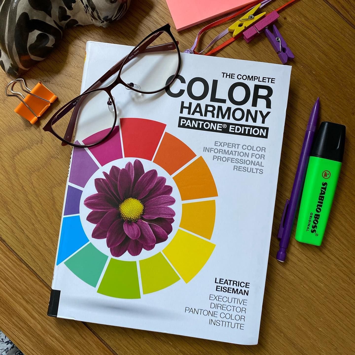
I'll be totally honest, I haven't 100% finished reading this book yet, but I absolutely love it so far. I've read about 50 pages so far and I have already been mind-blown several times. This book is a wealth of knowledge when it comes to color and has so much gold in it. There is a ton of information about color psychology, color basics, historical context for different colors and I am here for it! It also offers a lot of information about color pairings and different unique ways to combine colors. (I haven’t gotten to that part yet, but I seriously can’t wait to.) Even though I'm not done with it, I already know I'm going to be referencing it all the time in the future with client projects.
Conclusion
Color is a foundational element that I use to bring depth and life to any brand I create. It has so much meaning to it and makes brands multidimensional. To me, color is a key part of any solid brand.
READY TO TAKE YOUR BUSINESS TO THE NEXT LEVEL IN 2022?
You can reach out to me directly to talk about bringing your vision to life for the new year!
Take care and talk soon,
Alex