
Business Revamp with Meaningful Branding, Web Design & Packaging Design
Storyboard Delights is an artisanal bean-to-bar chocolate company located in Longview, WA. They sell chocolate along with running a cafe and gift shop in their local town. Julisa and Eric use storytelling as a catalyst for creating the products in their business. To them, everything tells a story and that helps them create products and offerings that are meaningful and connected to the core values of their business.

The Mission
Storyboard Delights is a bean-to-bar chocolate company that strives to provide luxurious and unique confections to adventurous women. They enhance the lives of their customers by crafting unique customer experiences in-store and online through the process of storytelling. For me, my goal was to take the uniqueness and boldness of Julisa and Eric's personalities and translate that into visual branding that accurately communicates this.
The Outcome
The Storyboard Delights visual identity was designed to represent the funky and unique approach Julisa and Eric take to their business. I took an outdated logo that had some strong bones to it and updated it in a modern way that retained some of the old-timey characteristics about it that the couple loved. I also created a strong submark and pattern design for the brand that could be used in their packaging for their products. Finally, with this visual foundation in place, I created an easy-to-use eCommerce website for Storyboard Delights that allows them to tell the story about their business and sell their products to a wider range of customers.
The Impact
Since revamping their brand, Julisa and Eric have gained so much confidence in themselves and their business. They've received a lot of positive feedback from clients about their new visual identity. Furthermore, they're in the process of creating an updated marketing plan to boost their online sales.
Services
Brand Audit & Strategy
Visual Brand Design
Squarespace Web Design
Packaging Design
Connected by Color
Julisa and I met via Instagram in 2020. We originally connected about branding and web design for her personal blog Julisa Designs Happy, a fun, colorful project that was a joy to work on with her. We completed that project together in January 2021.
When we first met Julisa shared with me that she runs a chocolate company with her husband Eric. I have a deep personal love for artisanal chocolate brands and secretly hoped that down the road we could reconnect about designing some stuff for their chocolate business.
Fast forward a few months and that reconnection happened! Julisa reached out in March about creating a new logo design for their business to help elevate their visual aesthetic. She told me that she loves the style of my work and wanted some of the flair I introduce into other businesses to be added to their chocolate brand.
Brand Strategy
We settled on working on a brand audit and minimal design package in order to keep costs down. This would allow for an effective allocation of funds that would produce the most meaningful results for their business. This meant that, for me, I started their project by doing a deep dive into the strategy and design of their current business. I created a presentation sharing my findings and insights about their business. This included minimal brand strategy, only focusing on the most meaningful and insightful parts to ensure I had a strong grasp of their business before moving forward with any design.
I also shared areas for improvement and a potential framework for moving forward with new designs. This included an updated color palette and moodboard which took into account elements from their current visual aesthetic and incorporated that with a new way of interpreting it.


Sacred Pause
I decided to stay in town for my sacred pause for this project. I did two things to put me in the right space for working on the design for Storyboard Delights. First, I headed to my local fair trade grocery store. There, I spent time in the chocolate isle scouring the different brands of chocolate they had for sale. I’ve always been super interested in food packaging and design, so I took note of my favorite bars during my visit to the grocery store to reference while designing for Storyboard Delights. Since they also run a cafe, I also headed to a local coffee shop for a cheeky cup of coffee and pastry. This really set the tone for my designs. I felt indulgent, excited and motivated. This set the tone for the design process I planned to jump into after these experiences.
Brand Design
Upon their approval of the brand audit and strategy presentation, the next step for me was to design. This is where I really had to put my thinking cap on. Eric had shared with me that he was worried about the direction of my moodboard because he thought that my updated visual direction would take away from the quirky, fun nature of the brand they had already built. I had to be cognizant of this fact and make sure that what I created for them was still updated and elevated, but remained within the realm of playfulness that their brand lives in. For me, it was all about finding balance between the old and the new.
For their main logo, I wanted to retain the basic structure of the previous logo. I wanted it to be a wordmark and I wanted it to retain the same format—Storyboard stacked over Delights. That in itself was a great base and worked well for their logo, where it stopped working for me though was the typeface. I spent a long time looking for the perfect font for their logo. It needed to have that balance I was looking for in order to create something that was both familiar and new at the same time.
Eventually, I settled on a combination of Mollas and Black Quality from Creative Market to create their wordmark. I also custom edited some of the letters in the fonts in order to make sure Mollas and Black Quality blended together seamlessly in their wordmark design. I also played with the kerning to ensure all the letters were evenly spaced from one another. This also helped blend the two fonts together. Finally, I added a fun colorful border to the text to introduce a more modern element to the design. This border added a quirkiness and colorful element to the otherwise elegant design that added that balance I was looking for in their logo design.


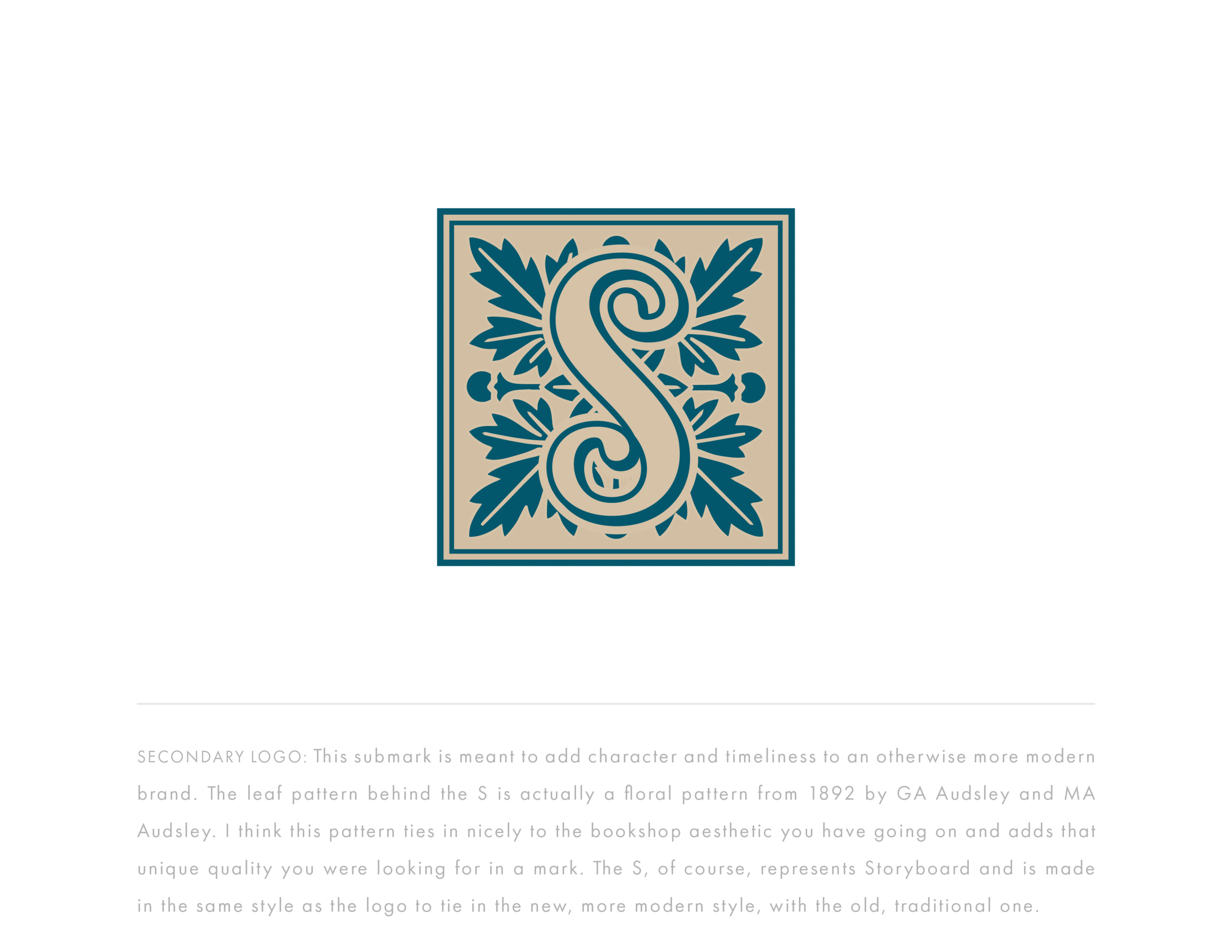
After finalizing a direction for their logo, I then wanted to create a bold submark to add some visual interest to the brand. Their previous submark used their business initials, and I liked the idea of keeping those, but reimagining the context in which the submark was designed.
Eric and Julisa had shared that they wanted their submark to look like something you could find on a treasure hunt. Something that could be used as an emblem and stood on its own. They wanted it to have character and almost look like a piece of treasure. With this brief in mind, I knew I had my work cut out for me.
At that time I had just learned about public domain photos and immediately turned there to find images of patterns from history. Working with Julisa on a previous project came into play here because I knew she was a lover of bold colors and patterns. That is why I was looking for a pattern from history to incorporate into their brand. Yes, I could have designed one from scratch myself, but the fact that their business relies heavily on fairy tales and stories from history made me want to search in the public domain for something already in existence to use for their brand. Furthermore, I knew this pattern had the potential to make it into the packaging design for their chocolate bars as well, and wanted to create something that fit the initial brief with their brand design: creating something that is both familiar and new at the same time.
I went through a few different patterns online before I settled on one that worked for this project. At first, I was trying to work with designs that were too fine and intricate and it was leading to submarks that looked nice, but wouldn't work at small screen sizes. Eventually, I came across a floral pattern tile set of images by GA Audsley from 1892. This set of tiles had the detail I was looking for in the pattern, but was also bold enough for the application I was looking to use it in.
After manipulating the photo of the pattern, I created a tile-looking submark with an S incorporated into it representing Storyboard Delights. The effect I created makes the submark look like a monogram of some sort and definitely feels like it could be on a piece of treasure from history. Overall, the design I created is simple enough that it is still readable but detailed enough that it adds a bold quirky touch to the brand that I was looking to add. I think this more intricate design complements the more simplistic logo in a unique way.

Storyboard Delights Showcase


From Branding to Web Design
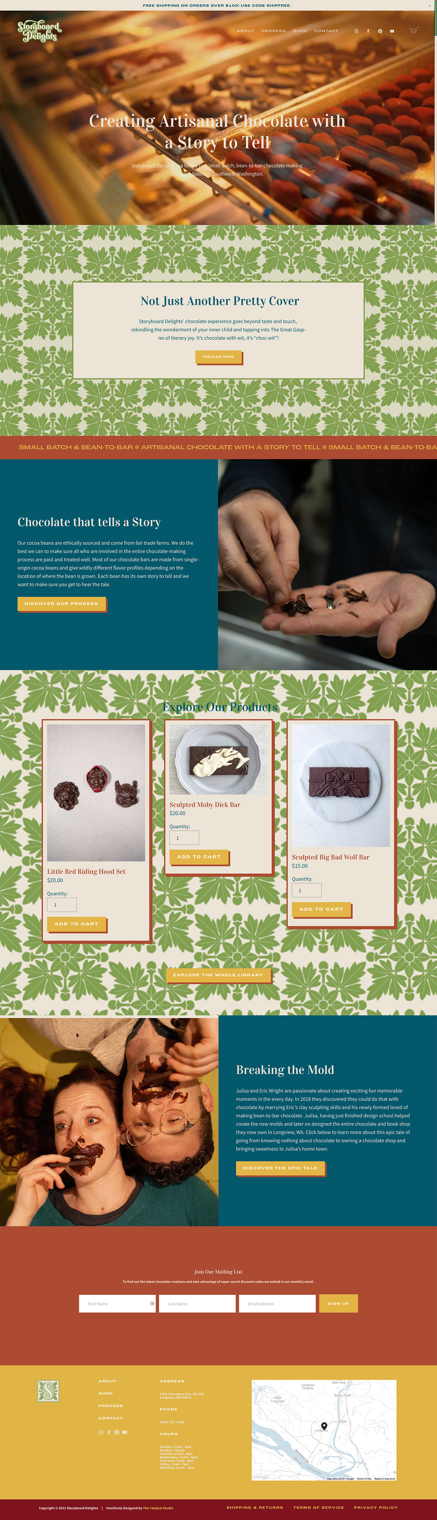
After the success of this rebrand for Storyboard Delights, Julisa and Eric decided to move forward with a full website redesign as well. They wanted their online presence to match the new branding I had created for them so they could start marketing to a large audience of people online.
When we initially talked about web design for their project, they shared that their previous developer had built them an eCommerce website on WordPress using WooCommerce. For me, I find that WooCommerce is the most difficult platform to use for eCommerce from a consumer standpoint so recommended that we move Storyboard Delights over to Squarespace.
I recommended Squarespace because it has robust eCommerce that will fit the volume of products they have in their business. Storyboard Delights is only selling about 10-15 products online, which makes them a great candidate for Squarespace eCommerce. If they had had a product quantity much higher than that (say 30+), I would have recommended Shopify for them instead, which is a better option for higher volumes of products.
Website Strategy
As I do with all my projects, I started this website phase with strategy. I investigated Julisa and Eric's business again to create a Website Strategy Presentation that included information about their website goals, client profiles, and styleboards. This strategy phase added a level of depth which we didn't get to explore during their brand strategy phase, so I was grateful for this exploration before pushing forward with their website design.


For the website styleboards, I knew I wanted to create something loud and bold for the Storyboard Delights website. I also wanted to ensure to incorporate their brand pattern into the design and have that take center stage on the website. A lot of competitor bean-to-bar chocolate brands that I looked at take the more refined, elegant approach so I thought going the more loud and bold route would create some contrast to the other competitors in the space.
Front End Design
I used the approved styleboards that I shared with Julisa to pull together a strong and different website design for Storyboard Delights. It focused a lot on color and introducing different coding elements to take Squarespace to the next level. For example, I incorporated a marquee and unique button style to add pizzazz to the more simplistic site design. Nevertheless, I wanted to ensure the site wasn't too loud so that it would detract from the gorgeous videos Julisa and Eric produced for their business. Again, it was about finding balance in my approach to the site design.
Besides creating a stunning visual environment for Julisa and Eric to sell their chocolate online, I wanted to make their website easy for them to use and navigate. Julisa had previously shared with me that her old site on WooCommerce was difficult for her to use on a daily basis. It was so bad that she didn't use it often, which resulted in lackluster online sales.
Backend Simplicity
The beauty of Squarespace is that the backend environment is really easy to use. With their built-in features, Julisa will be able to go in and easily add, edit and remove products on her own. She also has an integration with Shipstation which will allow her to get all her orders together for shipping in advance, and then take them to the post office. This new system is so much more user-friendly and the biggest reason I advocated that her business switch over to Squarespace.


On top of that, I have created step by step tutorials for Julisa and Eric about how to manage and use their website. From eCommerce to simple editing, I have made it easy for them to use themselves. This website is creating a strong foundation for Storyboard Delight's revamped marketing efforts in the future.
The Results
Julisa and Eric love their website! They’re so inspired they want to ramp up their marketing efforts and start focusing more heavily on online sales. With a newfound empowerment toward taking the online world by storm, I have no doubt they’ll be increasing their sales and reach through online traffic via their website!
“I’m just GIDDY looking at this website. Like, this seriously inspires me to make sure we kick ass and take everything to the next level.”