
Cohesive Visual Messaging & Web Design for a Spiritually Minded Business
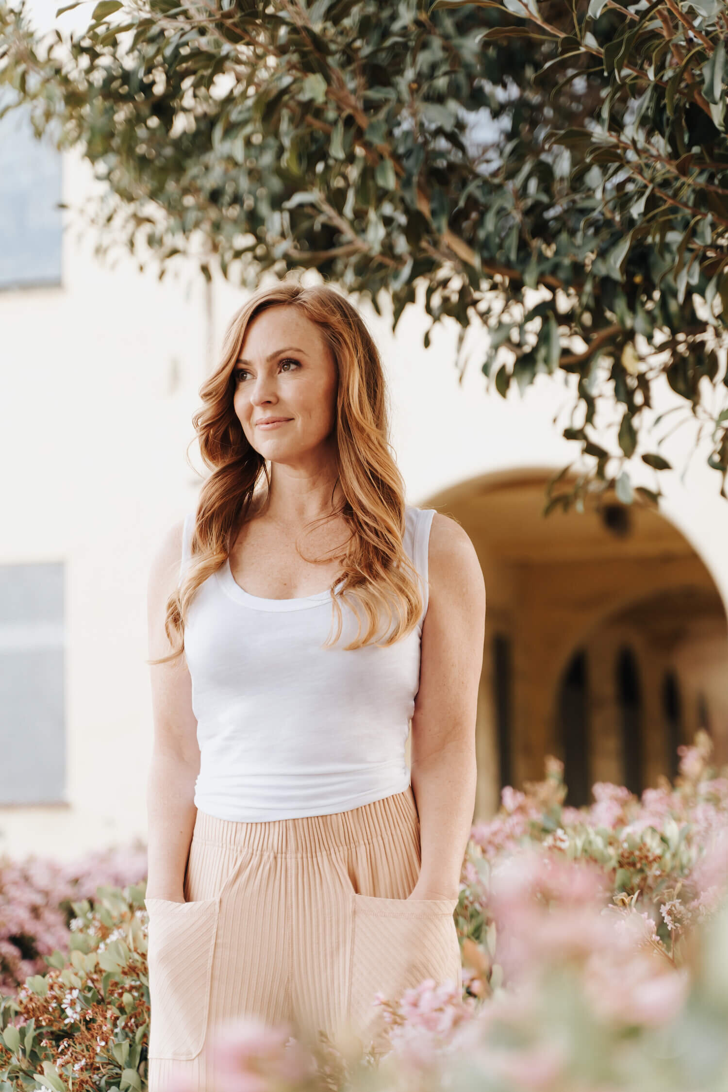
Molly Hamill is a coaching business that offers group life coaching programs. The focus of the programs is to help clients release programming that keeps them stuck and in cycles of burnout and struggle. Molly believes that breaking through these barriers will allow women to start experiencing more fulfillment in their lives. She shares wisdom, techniques, and knowledge from her own personal experiences in the corporate world, and shares a methodology that is transformational and that she truly believes in.
The Mission
People who need to shift their lives need access to tools and methodologies that actually work. They need access to a practitioner that will actually help them achieve positive transformation and give them the space to do so in a safe container. This is what Molly does in her coaching business. My goal at The Arcoíris Design Co was to help Molly communicate the depth of her offerings to her audience.
The Outcome
Molly Hamill's visual identity was updated and refined to more accurately represent Molly and her business goals. I updated her logo suite and brought in some refined yet whimsical elements to create a high-end logo with some charm. Upon completing these refinements to her brand identity, I then applied the updated brand direction into a fully customized WordPress website. This website was built to showcase the depth of Molly's brand but also maintain some of the features she had from her existing website.
The Impact
Molly has successfully launched two course offerings since launching her website. She has more confidence marketing her services and has an easier time booking clients with an updated website that accurately reflects her business.
Services
Brand Audit
Visual Brand Design
WordPress Web Design
Connected via Referral
Molly and I met through a referral from another client of mine, Trish Taylor. Molly originally reached out because she was looking to update her website. Based on what I could tell initially about Molly as a person and her goals for her business, I believed there was a disconnect between both her branding and her website at the time she reached out. After some back and forth, we agreed to move forward with a brand audit and then move into a WordPress redesign for her business.
My brand audits always start with strategy. I have a brand strategy questionnaire I share with all my clients and require them to fill out before our project start date. This document gives me the basic building blocks I need to understand my client and their business better.
Along with the strategy document, I also go through all of my client's social media accounts, their website, and anywhere else they share themselves online.
This allows me to deep dive into their values, their messaging, and their services. I do my best to uncover their unique positioning and what sets them apart from their competitors. From there, I take a look and see how these values correspond with their current branding.
This is the exact approach I took with Molly's brand audit. Through my research, I discovered that Molly is a spiritually minded entrepreneur who has a master's in Industrial Psychology. This background allows her to stand out from her competition because she has the credentials to actually give advice to others. I also discovered information about her audience and how she can interact with them more effectively. From there, I was able to synthesize this information with her current branding to determine if it was working for her in the best way or if it needed to be updated.
Brand Audit
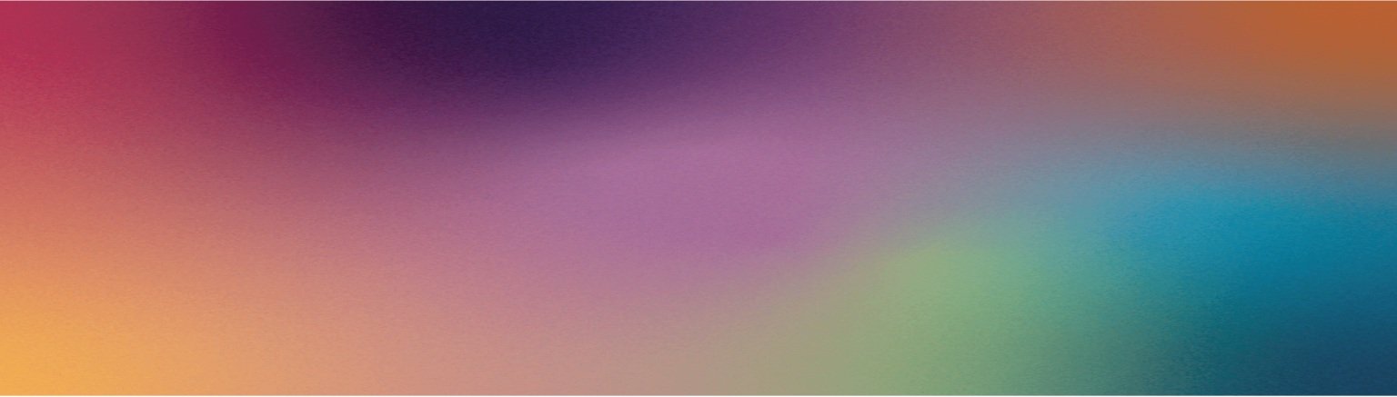
When reviewing Molly's current branding, it was clear that parts of the branding were solid and did work, while others were a bit more disjointed and did not. Her color palette was one of those areas that I determined to be solid. Using color psychology, I determined that the colors she had previously chosen for her brand all conveyed the right messaging for Molly's brand. For this reason, we did not change the color palette of the brand.
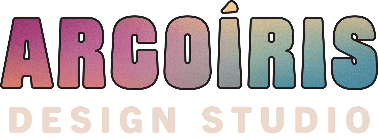
In contrast, I determined that her main brand elements did not have that same cohesion with Molly's brand messaging. To me, they were sending mixed signals to her audience. Since Molly's brand was very minimal in nature, I focused on the meaning of the typefaces chosen for each brand element to determine their meaning and messaging to Molly's audience. For example, when Molly initially reached out to me for my services, she had a bold, slab serif main logo and a thin, modern serif alternate logo. Slab serifs are often denoted as a confident typeface and the one Molly was using, in particular, was more quirky in nature. Serif fonts though are typically seen as established and authoritative. The font Molly was using for her alternate logo was also quite thin which added an elegant touch to Molly's brand. These two brand elements were sending different signals to Molly's audience. For this reason, I expressed interest in wanting to update them and create more cohesion in her brand.


Brand Design
Overall, my goal with Molly's visual branding was to make her brand more inspirational and approachable.
My goal was to combine elegance with simplicity to achieve balance in Molly's brand. I updated the font choices in Molly's more minimal brand elements to portray that her brand is inspirational, refined, and polished. I designed a wordmark for Molly's brand to keep the brand system on the more minimal side. Nevertheless, I still chose a font with a few embellished details so it didn't look too plain. I also created a simple submark that can be used across social media or brand assets, updated her brand icons, and created course logos to match the new direction. My goal was to create a timeless brand that would work for Molly's growing business for years to come.
Molly Hamill Showcase


Website Strategy
The next step was to start strategizing an approach for Molly's new website. When we initially discussed Molly's website, we decided that it was best to build Molly's website on WordPress. She already had her current site there and had built some SEO toward the current site. We didn't want to disrupt those current rankings, so ultimately it was decided it was best to move forward with WordPress. Furthermore, Molly's blogs a lot on her website, and since WordPress has robust blogging features, it was a no brainer to keep her on WordPress. Plus, Molly already knows how to use WordPress so wouldn't need to take the time to learn a new platform.


Molly's Website Strategy Presentation dove into details about her audience, her website goals, the pages that would be included on her website, and styleboards. One of my main problems to solve was how to incorporate pops of sparkle and embellishment, which Molly expressed she loved, while also maintaining the integrity of the brand direction we moved into. Furthermore, I was looking for a way to create a website that was both beautiful yet not boring to scroll through. Through Molly's styleboards, I came up with a direction that I'm happy to say she fell in love with and ended up directing the whole direction for her website build.
Front End Design
As I mentioned previously, Molly's brand design is on the more simple side. It's refined. It's elegant. It looks gorgeous, but there's not a lot to it. For this reason, I at first was struggling to create a site design that I felt accurately reflected Molly and her essence. Since she is the front-facing figure in her brand, it was important for her website to take a direction that felt like it truly reflected her.
One thing that Molly had shared with me through our calls together was that she loved gold and she loved sparkle. I kept coming back to these details and wondering how exactly I could incorporate them into the brand. I sat with this for a while and ended up coming up with a watercolor, glitter direction for her brand. Using a collage style, I pieced together a design for Molly's site that felt unlike any other website online. It is organic. It isn't boxy. And it has all the gold and sparkle we were looking for.

“OMG FUCKING GORGEOUS!!! So psyched!!!!!!!! You truly are a unicorn. I am tearing up. You brought to life the vibe I had in my heart. thank you so much!!!!”
Website Glamour
I incorporated gold leaf details and sparkle burst elements into the site design. These elements are the embellishments we needed to take Molly's brand to the next level. Glitter shapes were added. Gold splatter details were incorporated. A subtle gradient background was incorporated as well. All these small visual details made a difference in taking a beautiful brand and transforming it into something memorable for Molly's audience.
Templated Design for Empowered Website Use
On top of building Molly a gorgeous set of website pages, I also build a sales page template for her to use for her various course offerings and programs. This sales page template is fully customizable and duplicatable in nature. Molly has the ability to create a new web page any time she needs to as a part of the marketing efforts for her business.
Plus, I provided Molly with step-by-step tutorials to empower her to take over her own site management. I have built the site in a way that allows Molly to update both her copy and her photography on her own, without me gatekeeping that information from her.