Evolutionary Branding & Web Design for a Life Coach Turned Spiritual Mentor
Catherine Andrews, initially celebrated for her role as a life coach, writer, and speaker, has embarked on a transformative journey into spiritual mentorship. This evolution reflects a deepening of her commitment to fostering personal growth and self-discovery. Catherine's shift aligns with her passion for guiding others through their spiritual journeys, offering a more holistic approach to achieving meaningful and intentional living.

The Mission
My goal with Catherine was to create a seamless visual and thematic connection between her podcast/blog and her coaching services, highlighting her journey into spiritual mentorship.
The Outcome
The project resulted in a cohesive brand identity and web design for Catherine Andrews, merging her life coaching with spiritual mentorship. It enhanced her online presence, making her offerings clear and engaging, thus solidifying her position in spiritual guidance.
The Impact
The impact of our project for Catherine Andrews was transformative, elevating her brand's resonance with her audience and solidifying her reputation as a pioneer in spiritual mentorship. This branding journey not only aligned her digital presence with her evolved mission but also fostered deeper connections with her community, empowering them to embark on their own paths of self-discovery and growth with Catherine as their guide.
Services
Rebranding
Astrobranding
Template Remix

Reconnection and Renewed Vision
Years after our initial collaboration on The Sunday Soother, Catherine and I serendipitously reconnected, marking a pivotal moment for both of us. This reunion came at a time when Catherine was delving deeper into spiritual mentorship, seeking to redefine her brand to mirror this evolution.
Our paths crossing again was not just a happy coincidence but a testament to the lasting impact of our previous work and the aligned vision we share for making a meaningful difference through our professional endeavors.
Astrobranding
The Astrobranding Presentation for Catherine Andrews intricately aligns her astrological blueprint with her business’s branding strategy, focusing on how her Virgo stellium and Capricorn sun shape her entrepreneurial spirit and dedication to work. Her chart indicates a natural inclination towards business, emphasizing a practical, detail-oriented approach, and a knack for client relations. Key astrological placements like her Leo ascendant inspire a branding aesthetic that’s both bold and creative, with a color palette blending bright, sun-associated hues with grounding elements. The presence of planets in Virgo and Capricorn in her chart underlines her meticulous nature and ambition, guiding a brand strategy that is reliable, precise, and determined. This astrological perspective offers a profound insight into crafting a brand that not only resonates deeply with Catherine’s personal values and strengths but also stands out in the spiritual mentorship domain.


Brand Design
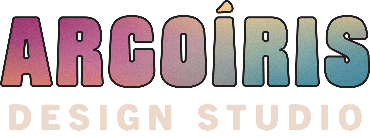
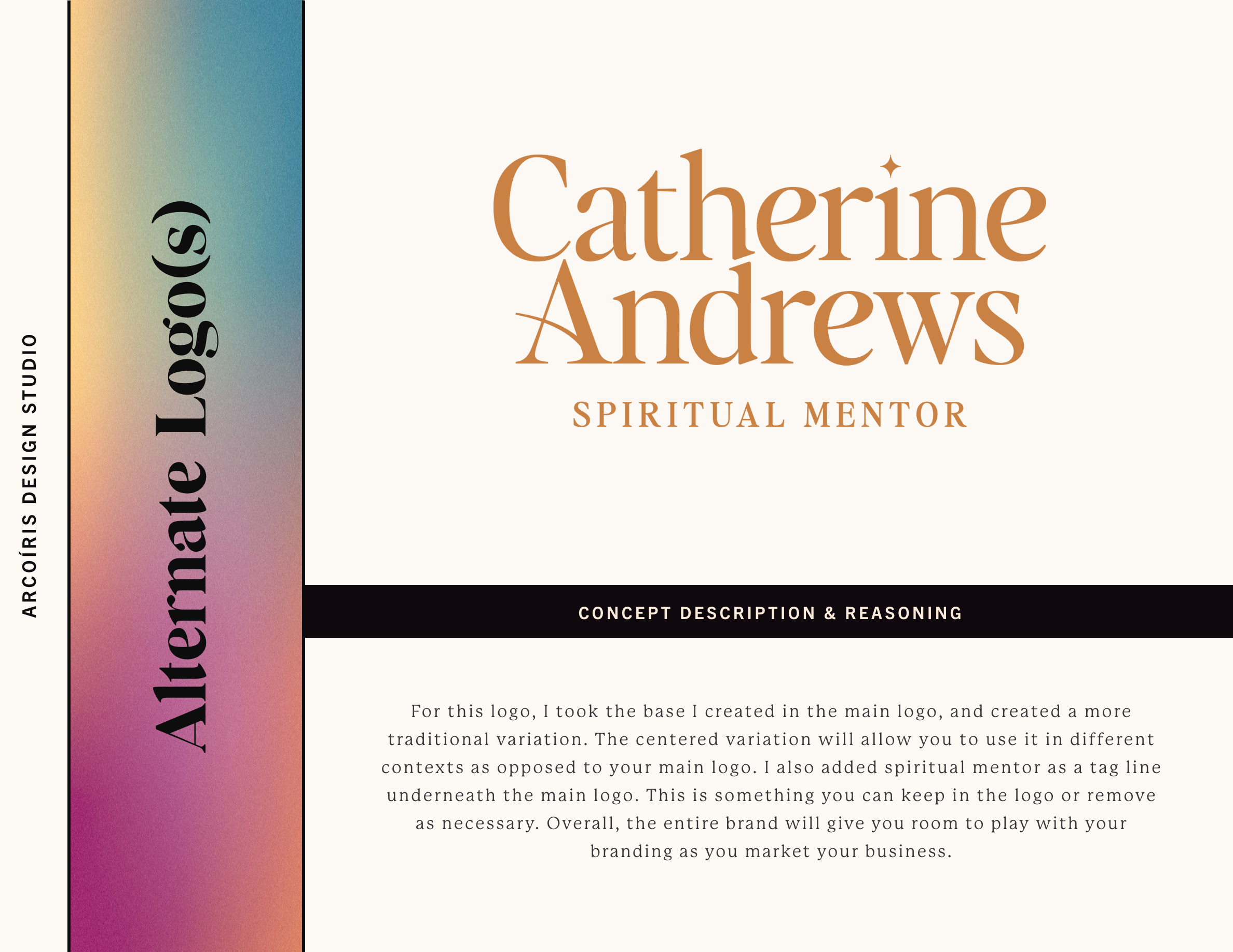
In rebranding Catherine Andrews’ venture, we merged The Sunday Soother’s essence with her spiritual mentorship identity by strategically using the podcast’s familiar heading font and color palette, ensuring continuity and recognition. This foundation was then enriched with spiritual nuances, like sparkles, to subtly evoke a mystical vibe, aligning with the brand’s deeper focus. The choice of lowercase for the logotype added a soft, feminine touch, inviting warmth and approachability. This design approach not only maintained a connection to the familiar but also embraced the new direction of spiritual mentorship, creating a cohesive and inviting brand identity.
Catherine Andrews
Showcase


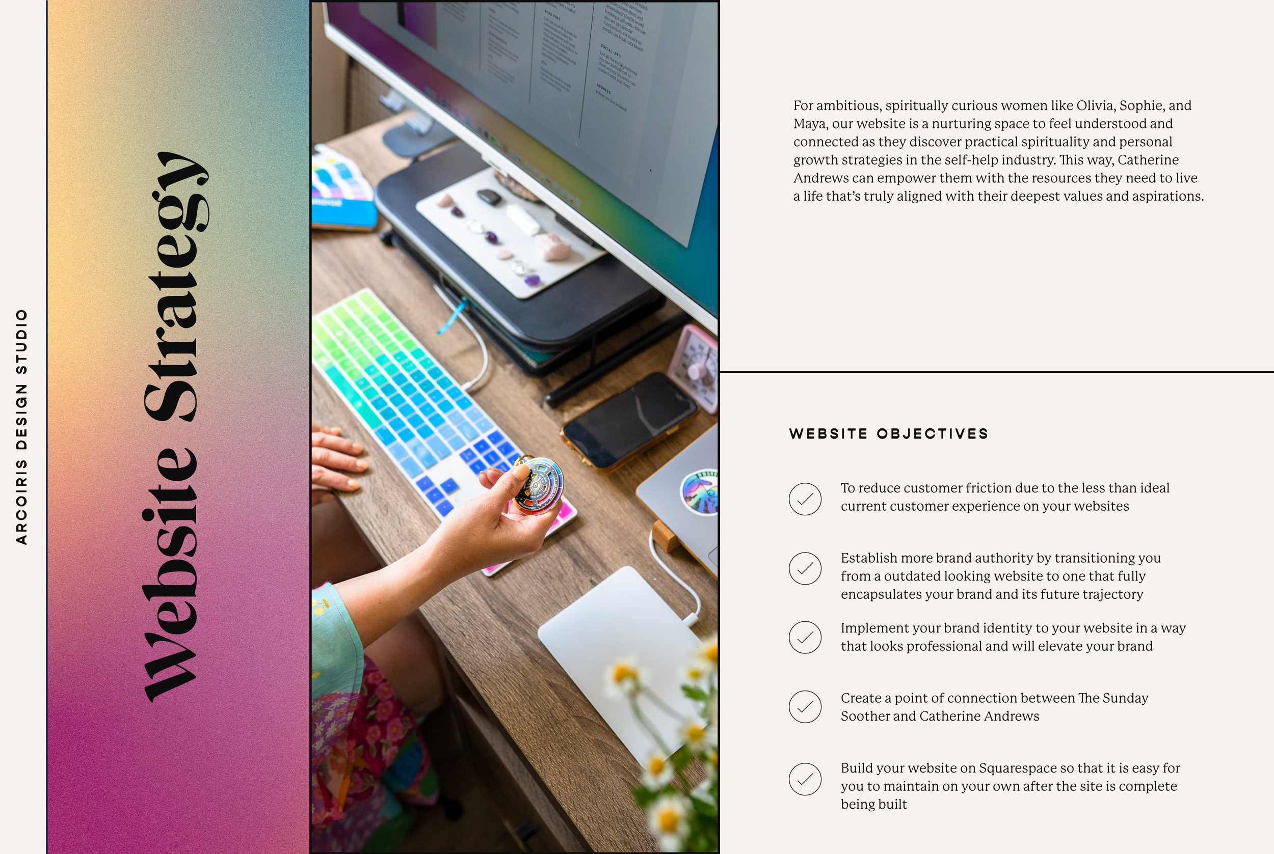
Website Strategy
Our website strategy for Catherine Andrews leveraged the Taurus template, previously used for The Sunday Soother website, as a foundation for creating a seamless bridge between her ventures. This approach ensured visual and functional consistency, fostering a familiar environment for her audience while introducing her expanded spiritual mentorship offerings. We focused on enhancing the user experience with intuitive navigation and incorporating specific elements like the color palette and main heading font from The Sunday Soother, reimagined with new spiritual nuances.

Subtle design elements such as sparkles were integrated to highlight the spiritual aspect of her brand, and we chose lowercase typography for the logotype to evoke softness and femininity. This strategic use of the Taurus template facilitated a cohesive, inviting online presence that aligns with Catherine's branding evolution.
For more on the Taurus template and its features, visit the Taurus template page .

Front End Design
Our website strategy for Catherine Andrews, based on the Taurus template, carefully balanced her spiritual mentorship with The Sunday Soother's essence. We crafted a digital sanctuary that serves as a comprehensive portal to her services, mirroring her journey and teachings.
User Experience (UX) Design & Visual Harmony: We achieved visual consistency by using The Sunday Soother’s font and color palette, enriched with spiritual motifs like sparkles, enhancing the website’s spiritual narrative.
Content Strategy: Tailored content targets her audience, focusing on her services rather than a blog, directing users to The Sunday Soother for rich, introspective content. Each webpage is designed to inspire and engage, reinforcing Catherine’s transformative mission.
Sales Pages & User Empowerment: The sales pages were specifically edited for easy self-management by Catherine, ensuring she can effortlessly update content, reflecting the dynamic nature of her offerings.
CTA & Engagement: Strategic CTA placements encourage exploration and action, from newsletter subscriptions to booking sessions, seamlessly guiding users through Catherine's spiritual and coaching landscapes.
This refined strategy underscores a seamless transition into spiritual mentorship, leveraging the Taurus template’s flexibility and the strategic absence of a blog to direct focus towards Catherine’s core offerings.

Experience The Websites in Action
Kind Words from Catherine
“Alex is intuitive, creative, organized and visionary, as well as just a joy to be around. You’ll be so happy with your results of your design/branding project with her!”