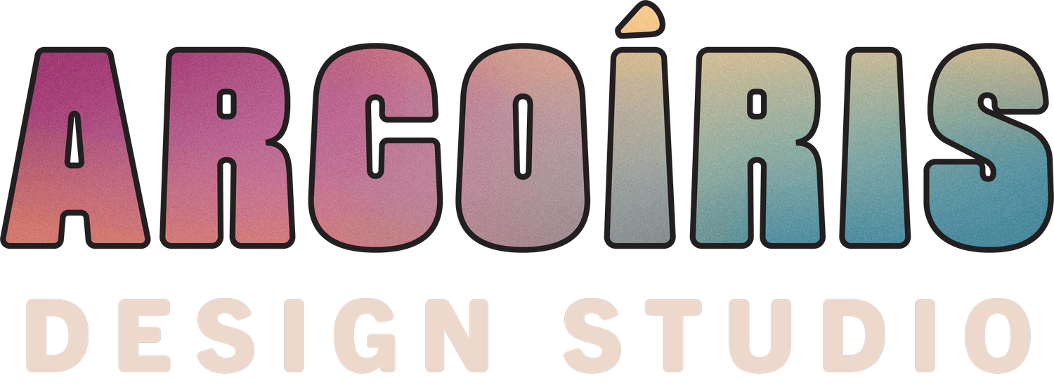

Brand Embodiment through Prismatic Branding & Web Design
McKenzie McCormick is a dancer, astrologer, herbalist, and multifaceted being. She has blended many modalities using movement magic under her brand AstroChoreo. McKenzie believes all bodies, human bodies, plant bodies, planetary bodies, etc. are cycling through celestial and sensual movement. It is her goal to provide meaningful guidance to help people live more embodied and connected with the world around them.

The Mission
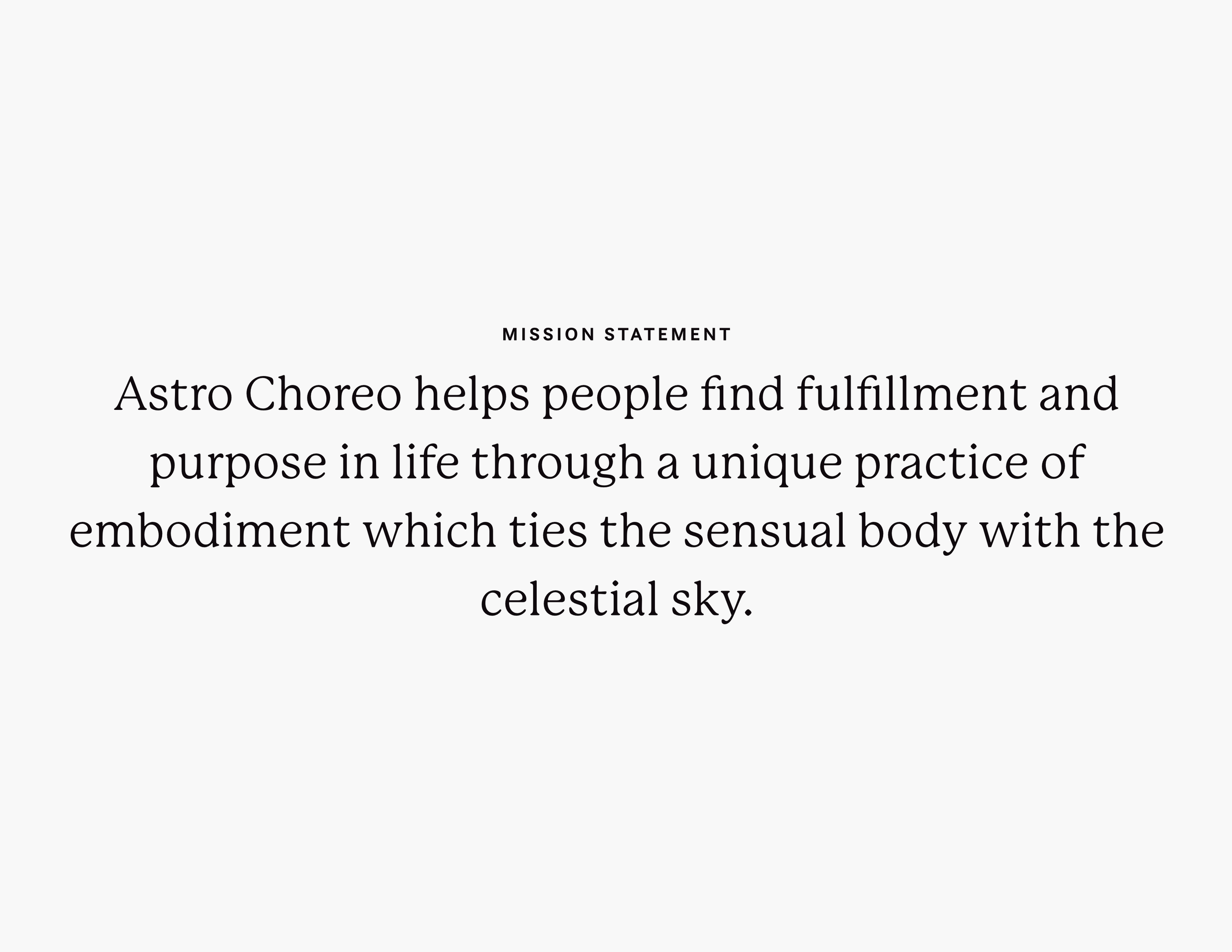
Everyone on earth deserves to connect to themselves and the world around them in a meaningful way.. Using astrology as a centering guide, McKenzie prides herself in helping people find a sense of embodiment in this lifetime. It was my goal at The Arcoíris Design Co to help McKenzie communicate her view that everything in life is connected and understanding this connection makes life easier to navigate and more meaningful.
The Outcome
I worked with McKenzie to design a brand for AstroChoreo that was rooted in symbolism and meaning. It has a depth of character that makes it meaningful and resonant to connect with. Through this, I was able to capture the core essence of her brand through a combination of brand marks. With this strong brand, we were then able to easily translate the brand into a website using one of the templates from the Arcoíris Template shop that will allow her to more easily engage with her clients outside of social media.
The Impact
Since the launch of her brand, McKenzie has developed a strong sense of self through her brand. She is more confident in business and confident in herself as a movement magician. Moreover, she is in the process of writing her first book, expanding her product suite, and continuing to grow as an astrologer.
Services
Custom Brand Strategy
Visual Brand Design
Squarespace Template Remix
Connected through Like-minded Community
McKenzie and I first connected via a previous client of mine (and business bestie) Gabi of The Stylist Witch. McKenzie and I were both students in The Perfect Style course and entered each other’s orbit because of it. I was drawn to McKenzie and her work because she moved in such a strong, confident way.
She witnessed the launch of my Squarespace website templates and eventually decided that it would be best for me to help her build out the website and brand of her dreams. I was super excited to help her with that process because McKenzie has a depth to her teachings and understandings that I was eager to showcase visually to her audience.
Brand Strategy
Prior to our work together, McKenzie’s brand was disjointed. I could tell through our initial conversations and through her brand strategy questionnaires that what her brand truly represented and what was being showcased in the world were not aligned. McKenzie has a depth and sensualness to her being that exudes confidence and grace. This was not being reflected in her brand presence at all.
Through my analysis of her brand along with her competition, I really wanted to highlight this depth in AstroChoreo as a whole. I also wanted to showcase McKenzie’s unique multifaceted approach to life and business. For McKenzie, everything in life is connected and through this connection, people can find true meaning and fulfillment in life.
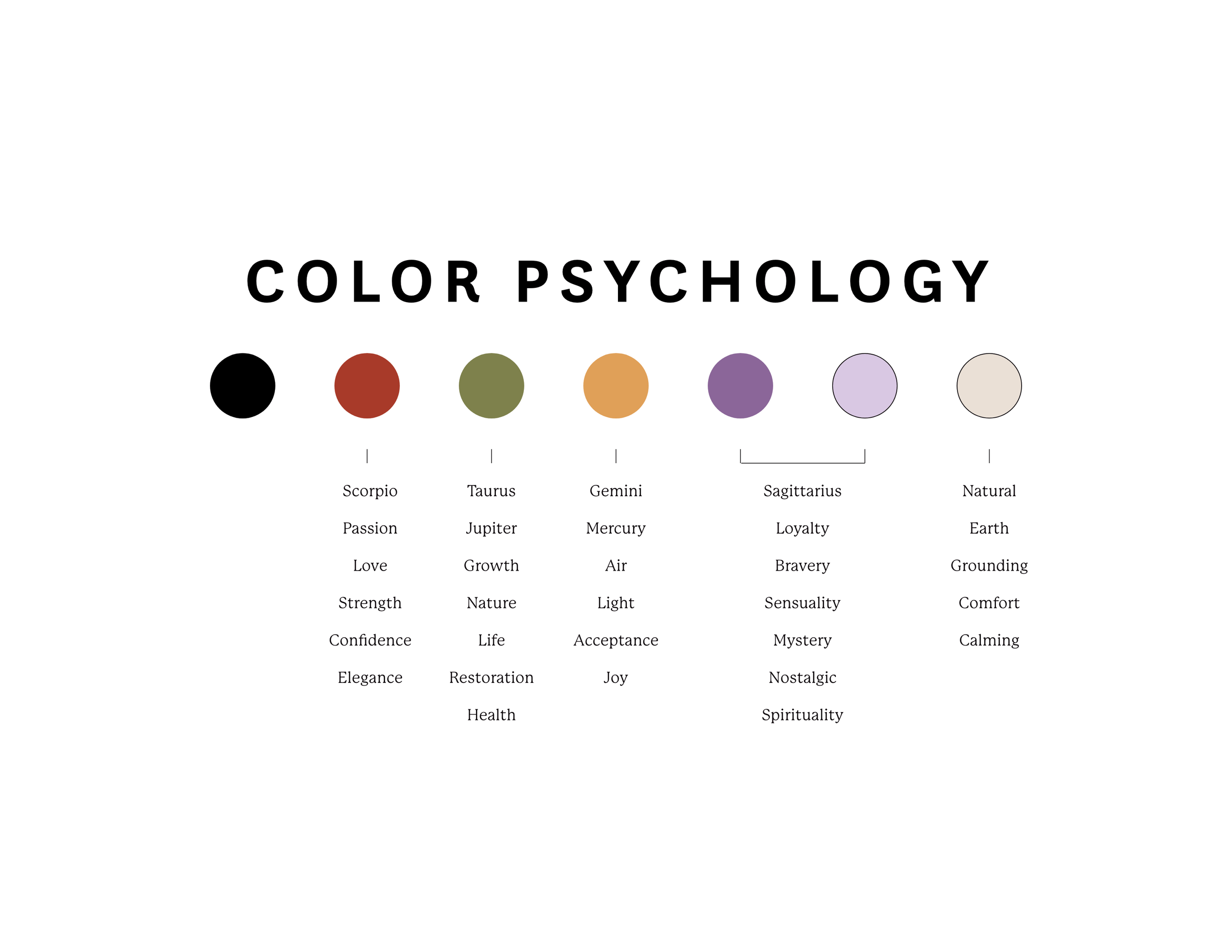
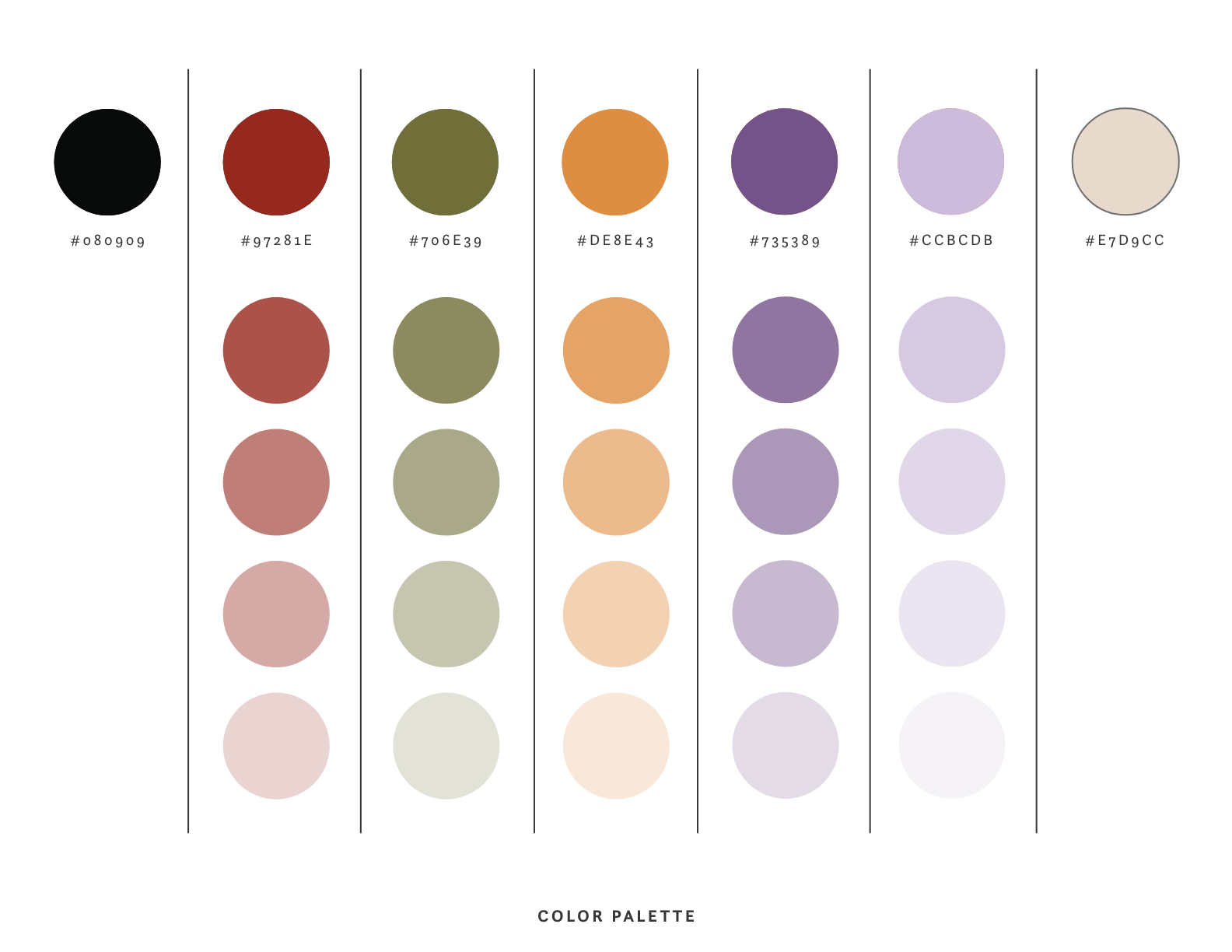
For me, this meant taking a prismatic and meaningful approach to the brand. I wanted the brand to feature warm, rich colors, connecting directly to the most impactful astrological placements in her brand. I wanted everything in the brand to have a strong association with one other, even if they don’t seem super connected at first. The entire brand was meant to be built in a highly intentional way, highlighting the importance of intentional living in McKenzie’s approach to life and business.


Sacred Pause
McKenzie’s brand was interesting because the sacred pause took place after the initial brand direction was developed. I had a strong intuitive hit as to what McKenzie’s main logo should be, and it actually came through super quickly. In contrast, it took me quite a bit longer to come up with a direction for the AstroChoreo submark, which we had decided should be a sigil logo.
Brand Design
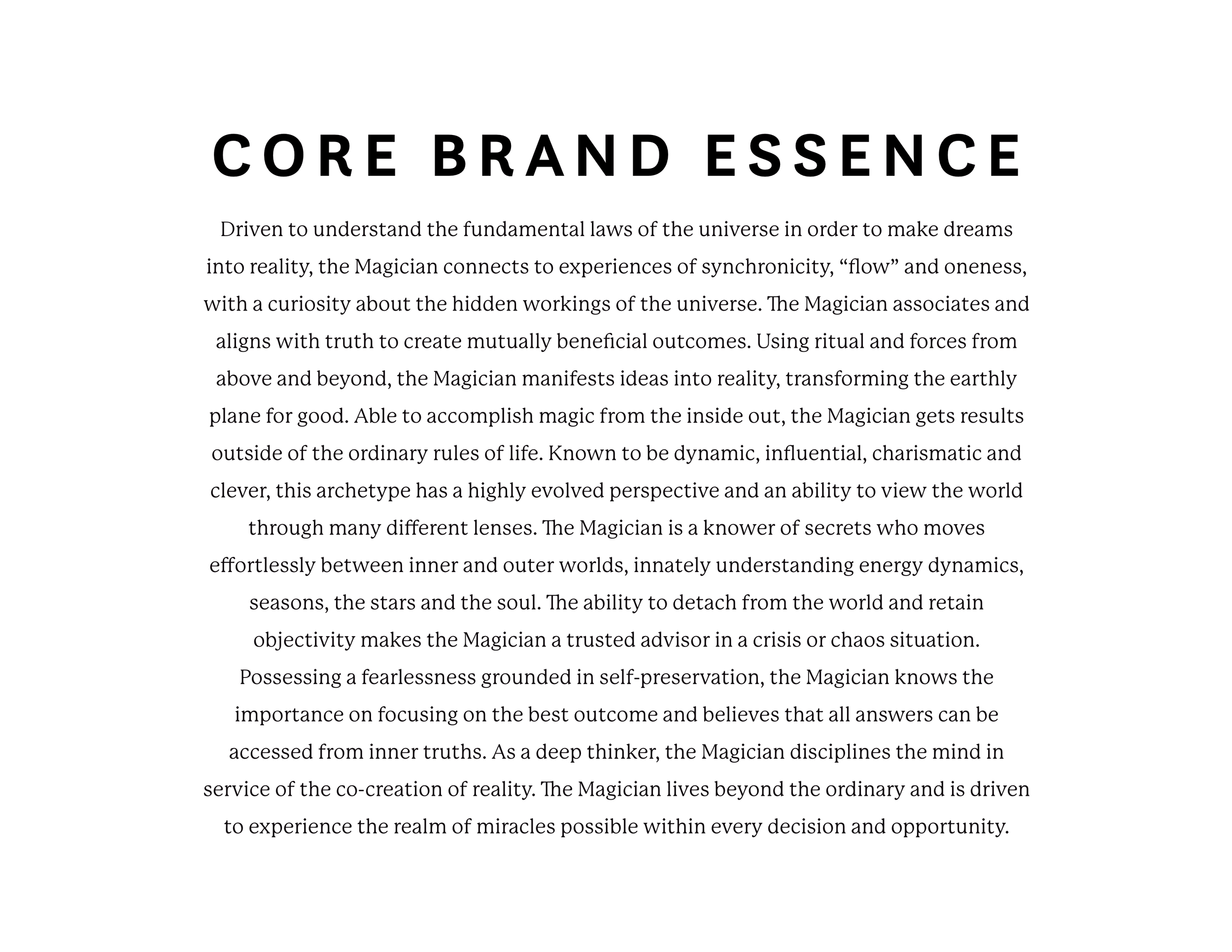
As I mentioned above, McKenzie’s main logo design came through super quickly. I wanted to create a high-end design that was rooted in spirituality and mysticism. It was bold and subtle at the same time, using a serif font with whimsical elements to create depth in the design. Sparkle elements also added depth, along with the combination of sharp and soft edges in the font design. I decided to create a more typographic logo for AstroChoreo, and use symbolism in her brand submark via a sigil logo to tell a powerful story and give her visual branding range.
Sigil logos are a type of brand mark I have developed that takes meaningful symbolism from various relevant modalities—witchcraft, mythology, astrology, ancestry, etc.—to create a potent brand mark. Sigils are powerful spells that lock in magic through their design. They imbue magic to anyone that views them.
My goal when creating any sigil logos is to lock in the core values in the design, along with associations of prosperity and abundance. In McKenzie’s case, I wanted to highlight embodiment, transformation, magic, connection, vitality, and nature in her brand mark. I used the consonants from her brand name to create the initial submark design and then added supporting shapes and symbolic elements on top of that. The result was a sigil design that was completely unique and had a lot of depth of meaning to it.
I also created an additional submark for McKenzie using interlocking letters. This was meant to give her overall brand range in applications. Her interlocking submark makes use of the A and C from AstroChoreo, and is meant to be easily noticeable in the documents where it is used. While the sigil logo is meant to add depth to McKenzie’s brand, the interlocking submark is meant to make it more recognizable.
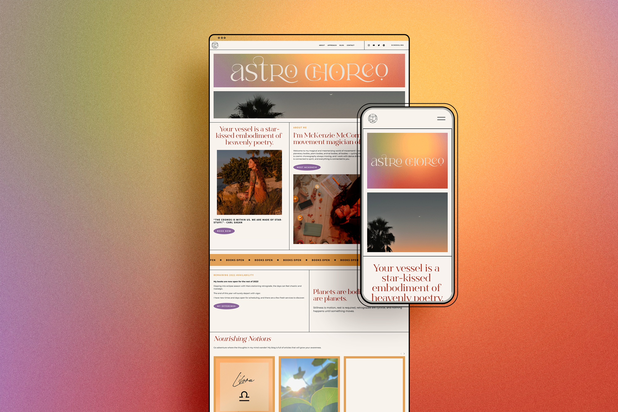
AstroChoreo Showcase


With McKenzie’s branding in place, we were ready to start tackling her website and bringing the brand to life online.
Template Strategy
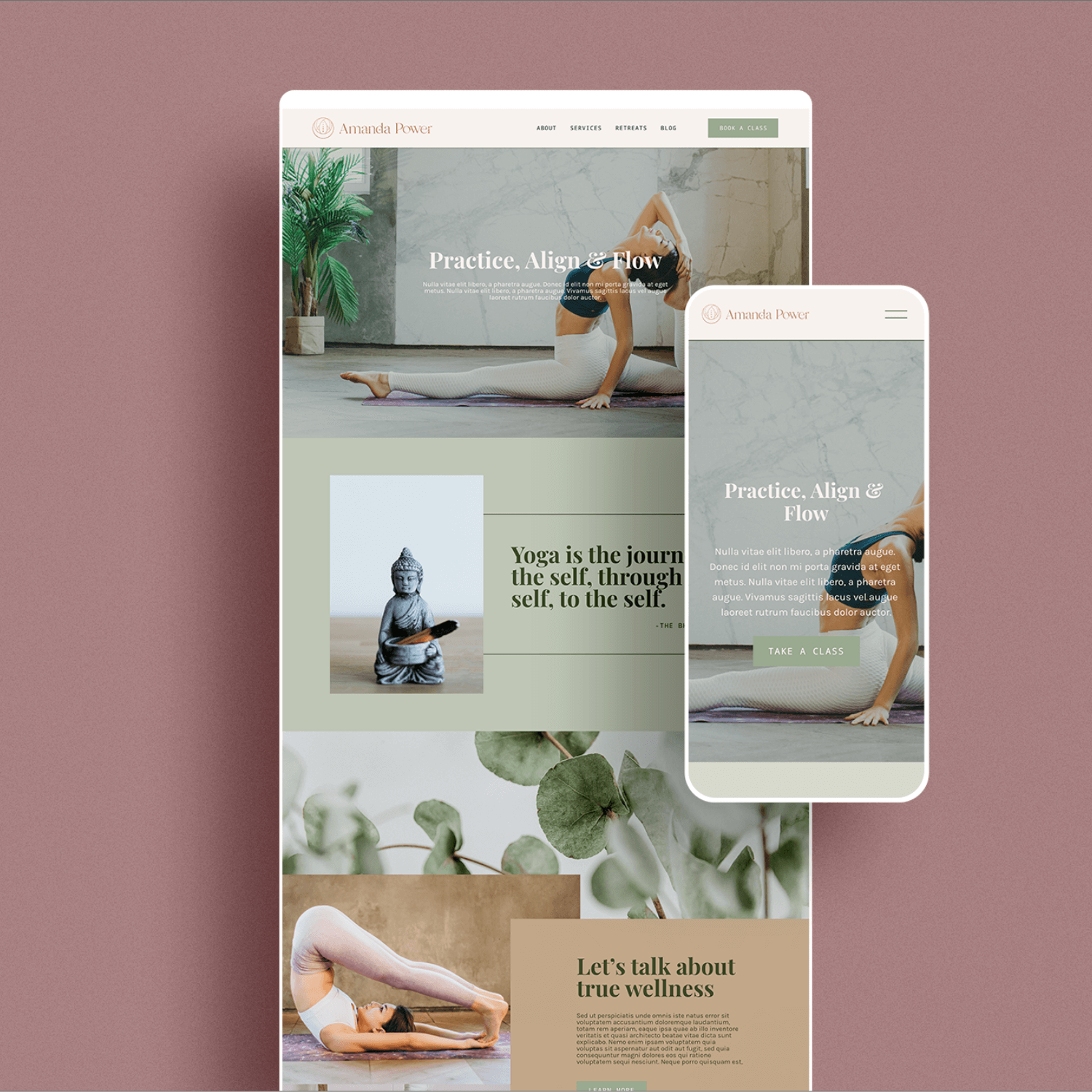
We had a 90-minute strategy session to decide how to tackle the transformation of my Amanda template into the site of McKenzie’s dream. We went through each page of the template during our strategy session and parsed out the exact changes we were going to make to the site, and also talked through any additional elements we needed to add to the site. Ultimately, we decided that not only was I going to transform the template visually, but I was also going to implement a strong scheduling system to help McKenzie book her astrology clients with ease.
Template Remix in Action
McKenzie provided beautiful imagery and photography to take her website to the next level. We also designed beautiful brand gradients to use as additional elements throughout the site design as well. I took all of the website copy McKenzie provided and integrated it seamlessly with the section templates I had pre-built into the template. And finally, I moved her scheduling system from a separate Acuity account and connected it seamlessly with her new website.
McKenzie was blown away by the transformation the Amanda template went through. Not only did her website not look like the template at all, but it also looked like a high-end custom site! McKenzie was so blown away, she stated that she wanted to add additional e-commerce functionality to the site in the future, which is something easily possible with the power of Squarespace.

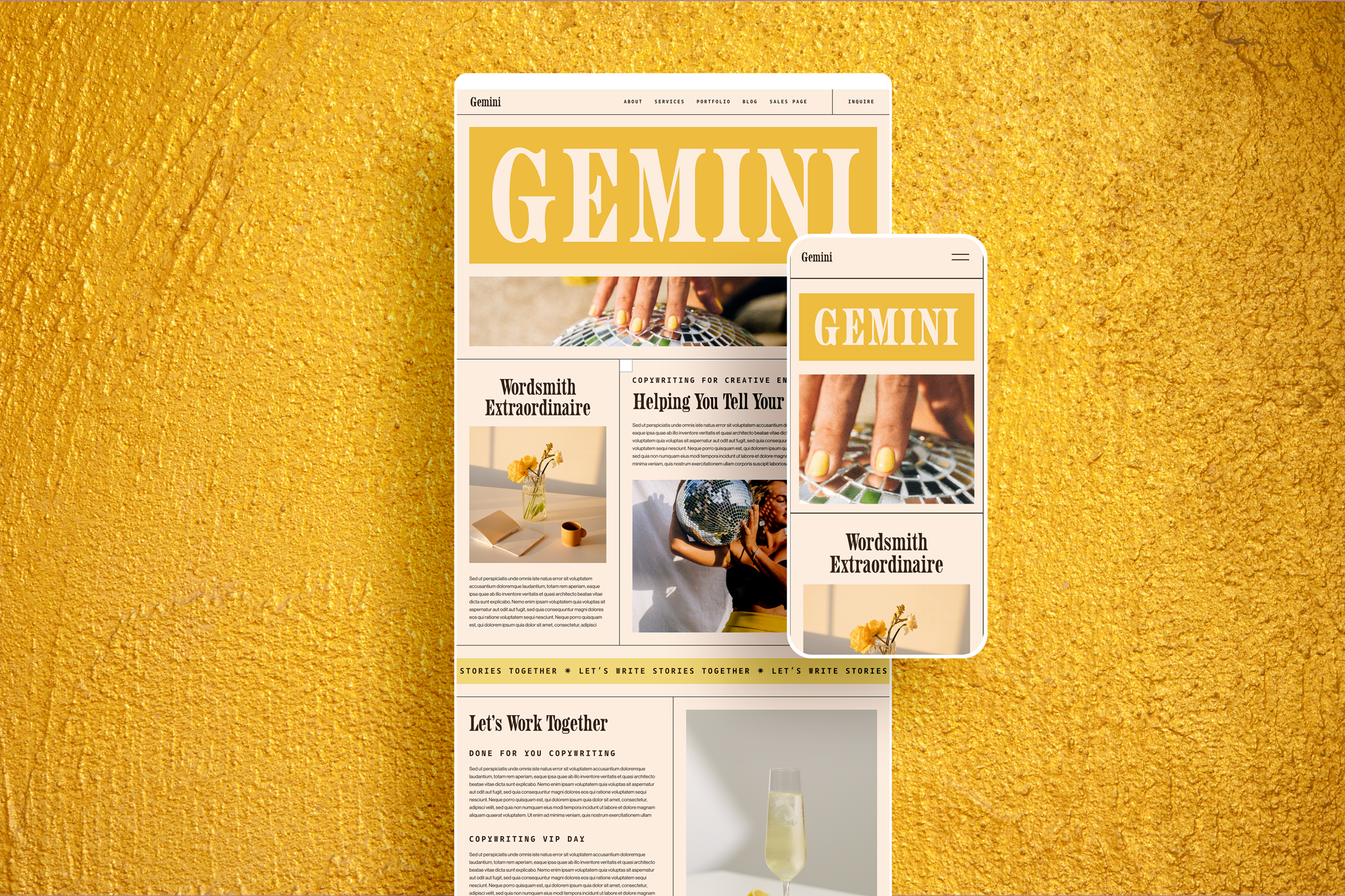
An Ever-Evolving Transformation
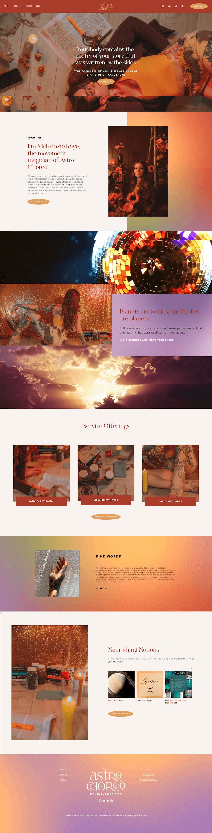
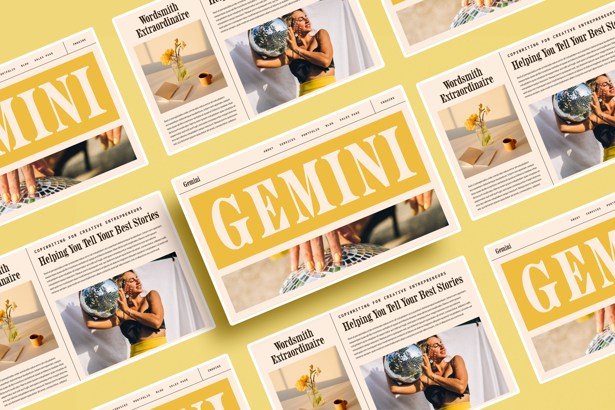
McKenzie is an astrologer and as such was super inspired by my astrology template series as I started releasing them. As a true hearted Gemini, she was eager for me to build the Gemini template and see how it turned out. To both our surprise, we were both blown away but what ended up coming through when I put that template together. We decided a few months after the template’s release that McKenzie needed to move over to that template. The layout would better serve her needs as a super communicative astrologer, plus, the design better fit her chart and brand personality. We decided to move forward with another Template Remix, moving her from Amanda to Gemini.
Template Remix in Action
In the span of 1 week, I was able to work with McKenzie to fully reinterpret her branding and make it fit in the Gemini template. The process of this shift began with us getting together for a strategy call, discussing what was working and not working on her current website, and then creating a plan of attack to get the site transfer started. I was able to implement her branding into the new template seamlessly, and received her approval on it in the span of a few days. From there, it was just a matter of transferring her Acuity and blogs over to the new site, and with that, we had a new version of the AstroChoreo website for the world to see! In the span of 5 days, we seamlessly launched a new website for McKenzie!

Gemini Template vs AstroChoreo Website


“I worked with Alex at the Arcoiris Design Co on branding for my business and creating a website with one of her template remixes, and I would highly recommend her!! From the very beginning, I could feel how much she genuinely cared about me and the project. And so thorough!!! Literally no stone unturned. Through the process, I loved talking with Alex about how things were developing, and making edits was so easy. I feel her work with color is groundbreaking because she’s daring enough to put colors together that might not traditionally seem cohesive, and she finds the right shades and combinations to make them perfectly pop together. Most of all, I felt so liberated through our work together because my brand now shines with all of the loud and vibrant authenticity that I put into it. Alex is an amazing designer, along with being a really wonderful human being, and anyone could benefit from working with her!”